
Data Visualization Assignment: Research on COVID-19 For UK
Question
Task: COVID
- Take the datasets related to Covid in United Kingdom from official national statistics website.
- Perform analysis and provide quality visualisation using observable tool.
- Analysis must be done related to
- How many deaths have taken place till now by age group
- How many people are infected by virus?
- Compare and contrast the data related to covid with other countries.
- Perform some analysis according to your knowledge.
- Data Visualisation with observable hq :
The tool is yet another system that tries to make visualisation accessible. There are several things that can be done: Produce visualisations / interactive explorations of datasets: Study it in comparison with other technologies (e.g. Jupiter ,Tableau) and that could focus on usability, or performance (Speed , volume of data.....), or other qualities that you decide to investigate. - The quality of visualisation is very important. The visualisations must visualise lots of data but in much understanding and easy way. Take the references of the websites
1. Gapminder.org which has lots of visualisation related to life expectancy. The visualisations
of our proposed project should follow some of the standards of this website.
2. Minard chart: Propose some visualisations related to covid in the pattern related to minard
chart.
3. Hans Rosling about visualisations
4. Ben Shnederman
Answer
Introduction
Corona Virus Outbreak
The research on data visualization assignment mentions that a novel corona virus in Wuhan, a town in the Hubei province of China, was reported at the end of 2019 as the source of pneumonia cases. It spread rapidly and led to an epidemic in China and an increase in cases worldwide. The World Health Organization named the 2019 corona virus disease COVID-19 in February 2020. The COVID-19 virus is referred to as the severe acute corona virus two syndromes (SARS-CoV-2); it was formerly referred to as the 2019-nCoV virus. COVID- 19 interpretation is evolving.
The World Health Organization and the US Centre for Disease Control and Prevention have provided provisional recommendations. The article addresses COVID 19 epidemiology, clinical symptoms, treatment, administration, and prevention. The topic explored in the data visualization assignment is discussed independently for community acquired corona viruses, extreme acute respiratory syndrome (SARS), and Middle East Respiratory Syndrome (MERS). Full genome sequence and phytogenic analysis revealed that the corona virus that causes COVlD-19 is a beta-corona virus in the same sub gender as the SARS virus but in a different category. The configuration of the receptor-converting area of the gall orphic gene is quite close to that of the corona virus of SARS, and the same receptor (ACE2) was found to be used for cell entry. The International Committee for Taxonomy of the Viruses' Corona virus Studies Group has recommended that this virus beidentified as a Severe ARS-CoV-2 (SARS-COV-2).
A third beta-corona virus, the Middle East Respiratory Syndrome(MERS),is more severe.Two bat corona viruses are like the sequence of RNA, and bats may be the primary source; it is unclear if COVlD-19 viruses are spread directly from bats or by any other process, e.g., an intermediary host. Two types of SARS -CoV- 2 were identified in a phylogenetic analysis of 103strainsofSARS-CoV-2fromChina,type L(70percent of isolates), andtype S(30percent accounts). The L-type predominated in China during the early days of the out break but remained below Wuhan's stage of strains. Such results have unclear health effects (Khanamet al., 2020).
The socio-economic impacts are apparent as the COVlD-19 pandemic progresses; therefore explore solutions for corona virus recovery focused on data analytics in several countries, companies, and individuals. Which must do to make it changed, and what might be more successful than others?
Spread of COVID-19 Virus
The emergence of SARS-CoV-2 from Wuhan Seafood Market, China, has been confirmed. However, it is still uncertain what the specific animal source is. The origin of the SARS-CoV-2 is unknown. With the number of infected cases and death, the situation with SARS-CoV-2 is growing more rapidly. Todeter the spread of SARS-CoV-2, the unparalleled control step staken have been successful. However, the number of cases of SARS-CoV-2 infection has continued to increase. Therefore, as noted in the data visualization assignment it is essential to identify that the spike is attributed to cases infected by population exposure, hospital contamination, or spread to the family before lockdown. This should be experimentally determined so that actual numbers of infected individuals and asymptomatic carriers can be disclosed. Many studies considered in the context of data visualization assignment have confirmed SARS -CoV-2 transmissions among humans; however, it remains to fully explore the process of communication and pathogenesis in the human spread? Does this virus's pathogenicity decrease with the rise in transmission rates during transmission from human to human? The epidemic can eventually end if the transfer of this virus is decreased.
None the less, SARS CoV-2 will become acommunity acquired, additional human corona virus if there is a continuous and effective transmission. Further actions in patients with undefined andmild symptom sare challenging to recognize. The study and clinical presentation of a group of asymptomatic infected cases will help identify later the number of individuals with signs and under stand whether viral shedding is less robust and how often asymptomatic carriers may further transmit viruses. An asymptomatic (15.8 percent) infection was elevated in children under ten years of age.
COVlD-19 can spread to patients with infected disease through respiratory outlets or by closer contact. The fecal-oral route's importance was demonstrated in SARS-CoV-2 transmission, as SARS-CoV-2 was isolated from fecal samples of infected patients. Never the less, this path of communication was rejected by a WHO China Joint Committee study. lt is not possible to underestimate the likelihood that SARS-CoV-2 is transmitted by human waste, contaminated water, aerosol, and air conditioners; this could have happened in the case of cruiseship, Diamond Princess, where the contamination of COVID-19 was widespread. However, further studies will be needed to verify the role of fecal-oral SARS-CoV-2 transmission. SARS-CoV- 2 infection may cause severe complications caused by neurology, respiratory, gastrointestinal, and hepatic death. Many studies utilized to prepare this data visualization assignment have shown that COVID-19 shows a profound sense of smell and taste, but it is uncertain whether this is an extraordinary feature of COVID-19. Up to now, we have no specific SARS-CoV-2 antiviral medicine or vaccine. However, the development of novel drug molecules, which would have a beneficial impact, may prove helpful in treating COVID- 19.
A great deal of development has been made globally to track and manage the transmission of disease. The mode of spread, asymptomatic or subclinical virus spreading, the nature of the illness, and the pathogenesis of the infection, the diagnosis, the signs, and more remain unknown. This underlines the need for an inclusive approach to biological analysis and mathematical modeling, which can help the government take appropriate steps and methods to prepare for this outbreak. While work into this epidemic advances quickly, most studies are unable to recommend and direct proper measures to contain this current situation. In short and long-term management of public health crises, however, high-quality research on data visualization assignment and predictive analytics and mathematical modeling are needed.
Data Analytics and COVID-19
Dataanalyticsand COVID-19 are sometimes discussed today as a single term. Scientists and public health professionals face a new corona virus, and the competition is growing to learn how it impacts humans to the maximum degree possible. Those are undoubtedly legitimate initiatives, but results are still being evaluated for progress before and during the corona virus spread (Akhtaret al., 2020).
Some people talk about corona virus as an enemy that can not be seen. We think of how citizen can behave though they were fighting the battle. Since the campaign, the planet has come around but never discussed this kind of corona virus. Previous attempts to aid healing are also not inherently appropriate since individuals struggle to determine the right path forward.
Rolls-Royce became conscious of this when data specialists were asked to participate in a project to support economic development through knowledge processing. The aim outlined herein data visualization assignment is to define the highest measures of periods of economic growth, and decide what businesses, individual firms, and policymakers may do to reduce economic recessions.
The partnership should also seek to understand how COVID-19 has affected the population's behavior and what such improvements can imply for potential recovery approaches. The group will freely make their findings available so that interested parties canlearn from them.
Also, health authorities utilize geospatial knowledge to understand how COVID-19 impacts other areas and populations. For example, certain apps encourage users to upload symptoms or track their well-being so that medical professionals can know more about risk populations or communities. Sectors such as telecommunications, banking, and insurers have used geospatial data for accurate pre-corona virusassessment. These tests can also promote regeneration.
For starters, tele communications providers might decide which places would best profit from improving their networks, allowing more businesses to utilize new tech solutions, such as mobile devices and applications, to re-operate, when people in place of power will make more informed decisions on whether they can improve visible beneficial recoveries by understanding the ties between data analytics and COVID- 19. Corona virus endangers civilization for a time, medical experts say. The elimination of the virus distribution decreases the healthcare pressure but does not remove COVID-19.
The Italian health sector employs data analytics in several areas, such as problem assessment, distribution of money, and the detection of hints. The hope is that the data analysis can personalize the efforts to help each patient recover and predict the duration of his stay inthe hospital. The usage and assistance of healthcare practitioners in making more successful choices for ill people may also improve artificial intelligence algorithms. ScientistsalsostudydataanalysisandCOVID-19totrackongoingclinicaltrials.Forexample, one website lists more than six hundred experiments and encourages users to sort the findings through diagnosis, virus intensity, and more. These datasets mentioned in the data visualization assignment offer valuable knowledge for policy making to know regarding the efficacy of individual strategies relative toothers.
Control Attempts Worldwide
New cases of COVID-19 (Corona virus) are rising spreading at impressive levels across the world, with an outbreak that has grown over I .2 billion people. Of these, approximately 65,000 have died, up to today. This sudden influx in cases and their health records has provided critical information and awareness hub. A significant volume of data on such occasions may be processed through a variety of data management systems automatically. These details outlined in the data visualization assignment were used to study and to identify the outbreak, pandemic, and intervention to fight the outbreak and its effects. Big data is a modern development that requires a vast amount of data about certain patients to be processed online. This allows us to examine patterns, movements, correlations, and variations on a statistical basis. It can also help to reveal insights into how this virus is spread and controlled. Big data may be used gainfully to reduce the risk of transmitting this virus with extensive data collection ability. A large quantity of information about those persons who have this COVID- 19 virus can be stored in large data technology. This leads to a thorough comprehension of the existence of this infection. The collected data can be further trained to develop future preventive methods. The system is used to store all types of cases that have been affected by COVID-19 (infected, recovered, and expired).
It is specified in the data visualization assignment that this information can effectively be used to identify cases and to assign resources for improved public health protection. Digital data modalities may be digitized and utilized to produce actionable information on clinical and population rates, including patient position, vicinity, patient monitoring, co-morbidity, patient physiology, and current symptoms. Big data provides experts, health care professionals, and epidemiologists a vast array of knowledge and facilitates them in making educated choices to fight the COVID-19 virus. This data will monitor the virus globally continuously and stimulate medical innovation. The influence of COVID-19 may be measured in a region and the population. It supports new treatment procedures for research and development. Big data can also provide people with potential sources and opportunities and help to cope with stressful situations. Overall, this technology offers data for the analysis, monitoring, and prevention system for disease transmission, movement, and health. Big data may lead to the statistical study of orthopedic and emergency surgery from accessible data in the orthopedics’ medical specialty. The latest pandemic is imitated for wound death and morbidity, and concepts from it may be cross-fertilized. This technique mentioned in the data visualization assignment helps to maintain records of orthopedic patients that can influence the actual and correct decision-making process.
It allows greater comprehension of the care strategies from the correct gathered evidence to enhance the results. Big data is a gift to conduct research trials and speed up treatment by reviewing the background of the case. Large data modeling can function as a pandemic to map, analyze, study, and avoid COVID-19. It will diversify supply and accelerate the manufacture of vaccines with deeper understanding. Prevalent models help to understand and provide an edge over the other process, such as the appropriate homology models predicted for each target protein using the fold and function assignment system servers. They have been extracted from the Protein Data Bank to forecast and diagnose the COVID-19 cure. Big data provides insights and analysis of the factors that contribute to better containment. With the aid of data collect ion and AI, China suppressed the COVID-19, which resulted in a low spread rate. AI will play a significant role in scientific studies, natural language modeling, social networking, and science literature mining, and there are many large-scale contributors behind this pandemic.
Orthopedic surgical expertise needs exceptional organizational capacity, scientific understanding,sufficientphysicalstrength,andgreatercomprehension.Incomparisontothese criteria, emerging technologies (e.g., AI), which have continued to establish advances inthe Orthopedic field and have had a significant impact on diagnosis and operation, have been introduce do verthe past few years. New technologies such as big data, AI , and 3D printing can bring about significant changes and innovations. This equipment provides improved quality and patient performance. Big data may also be used to identify alleged instances of this infection. It helps to prevent disease and to extract other valuable information efficiently. Big data help monitor and interpret the infection cycle of COVID-19 for the general population, physicians, other health care staff, and researchers. Data provided help investigate ways to slow or eventually present this infection, optimize resource allocation, and help decide appropriately and timely. This digital data storage technology noted in this section of data visualization assignment enables doctors and scientific researchers to develop a convenient and efficient COVID-19 testing method.
Purpose of Work As per the current situation of pandemic causing huge losses in entire world, the purpose of this work concentrates on performing data visualizations on the database collected by United Kingdom National Statistics. The purpose lies in presenting data visualizations using tools viz., Observable HQ and Tableau. Moreover, the comparisons are drawn between these two tools in terms of performance, accuracy and capacity to handle huge size of data.
Research Question
The research question for the work done in the data visualization assignment is “Which tool presents data more efficiently, Observable HQ or Tableau?”
Outline
The report on data visualization assignment is based on data visualization using two tools viz. Observable HQ and Tableau along with their comparisons. Literature review framed in next section of data visualization assignment discuses recent studies performed on direction of analysis of dataset based on Corona pandemic. The datasets are downloaded from official National Statistics, UK. This document offers insights of data visualization using ObervableHQ tool as major aim; many different aspects are shown in graphical format related to death rates, infections differentiated by countries, regions, continents, age and gender. Many analysis questions were framed at first before starting the task. The visualizations in ObservableHQ along with codes are shown after literature review section developed in the data visualization assignment. The line, pie and bar charts are selected to represent visualization. Later, visualization using Tableau tool is performed and necessary graphs are generated. Finally, comparison is done between two tools and report is concluded by listing major findings obtained in the data visualization assignment.
LITERATURE REVIEW
COVID-19
It is evident from the studies considered in this data visualization assignment that hundreds of civilians were destroyed by the sudden production of COVID- 19 inWuhan, Hubei Province, China. However, several affected people reported moderate flu-like effects and healed rapidly. Ruanet al. (2020) consider mild and severe behavioral predictors to allocate high-risk patients better.
In longitudinal multicenter research, 68 death cases (68/150, 45 percent) and 82 discharged cases (82/150, 55 percent) of lab-confirmed SARS-CoV-2 disease have been carried out using a Jin Yin-tan and Tongji Hospital database, with the help of Ruanet al. (2020). Patients fulfilled the requirements of release because no infection was observed for at least three days. Their respiratory capacity was increased dramatically, and the findings were adversely changed twice in sequence for SARS-CoV-2 studies. Case details covered profiles, health characteristics, test findings, care voices, and outcomes. The statistical study by Ruanet al. (2020), which contrasted with student's t-test and the Mann — Whitney — Wilcoxon test, described continuous measurements as means (SD) or as medians (lQRs).
Categorical variables were represented as numbers (percentage) and contrasted with the same check of p2 or Fisher. The age between the survival category and the release community was substantial (p < 0.001), while sexual ratios (p=0.43) were not relevant. Also, there was an underlying illness in 63% (43/68) of mortality and 41%(34/82) of the discharge community (p = 0.0069). (p = 0.0069). It is necessary to remember that coronary patients affected by SARS-Co V -2 (p<0.00 I ) have a slightly elevated chance of death. A total of 16 percent (11/68) were secondarily infected in dying patients, and 1 percent ( 1/82) were secondarily infected in the discharge group (p=0.0018). Research on data visualization assignment in thelaboratory has demonstrated significant differences in white blood cell counts, absolute lymphocyte, platform, bilirubin total, blood urea nitrogen, myoglobin, cardiac troponin, C-reactive protein, and interleukin-6 (IL-6) among two groups.
The patients in the death group were assessed for their survival. There were two peaks in the surviv all time distribution from disease start to death, the first about 14 days (22 cases) , and the second about 22 days (17 cases). There has been no study of the cause of death. Of the 68 fatal cases, 36 (53%) died of respiratory, 5 (7%) died of circulatory failure, 22 (33%) died, and five remaining deaths were due to an unknown cause. Depending on the clinical evidence review, we verified the death sofmyocard it is inseveral cases. This study, first reported by Ruanetal. (2020) utilized in this section of data visualization assignment said that the SARS -CoV-2 infection could cause brilliant my ocard it is. Because of the progression and severe condition of myocarditis, their findings should alert doctors not only to the symptoms of respiratory dys function, but also the signs of cardiac injury.
Which models are used to forecast COVID contamination and fatalities within the data visualization assignment?
According to the latest Italian press release, there was a record of 27980 contaminated and 2158 COVID-19 fatalities. Because of the rapid growth of the COVID- 19, multiple studies have been conducted in a short period to forecast the phenomenon and its effects. This segment of data visualization assignment provides details on all recent research, most of which apply to predictive analytics. The model of an epidemic prediction comparing infected density and level of symptoms is proposed by Giulia Giordano et al. (2020). A SlDAR THE model has been suggested by the author to redefine the reproduction level. The simulations also demonstrate that after the contrast with real data on the COV lD-19 outbreak in Italy, the proposed model provides specific performance. Melanie Bannister submitted critical research to determine the temperature associationandproofofCOVID-19inEuropeatal.(2020) . The author sargue that the variation in seasons, mainly in heat, significantly affects the COVID- 19 spread. The analysis indicates the possible candidate to reduce the spectrum of COVID-19 for higher average temperatures.
The first day for outbreaks and forecasts of COVID- 19, in Italy was described in a system by Lucia Russoetal.(2020).The investigators will approximate, based on the proposed study, the real count of COVID-19 cases revealed. A quarantine model on corona virus spread employing data analytic swas nicely present edby Vitaly Volpertetal. (2020). The main objective of this work is to evaluate quarantine mechanisms by mathematical modeling. The trend analysis of COVID-19 in China was present edby Albertine Weberet al.(2020),u sing a global SIR model. In this report, the data collection used for research on data visualization assignment is from the site of the Johns Hop kins University, and the disease is shown to occur in China. Simulation tests suggest that there would be a substantial decrease in the number of patients affected if the restrictions had been implemented a week ago. The literature addresses numerous ML models; furthermore, profound learning models should be used to make accurate forecasts to boost their precision.
However, in this multi-faceted and multimodal data used for forecasts instead of just one form of data, the estimates could be more reliable using adaptive learning models. Furthermore, the early forecast of COVID- 19 from a small dataset also proposes to make the public initiate critical actions and decisions to monitor the spread of new corona virus and used the composite Monte-Carlo simulation method. Experimental tests using a Monte-Carlo composite with a fuzzy law induction suggest that more robust Monte-Carlo outputs best support decision-makers. The study provided in the data visualization assignment above all is centrally based on short-term data available for the COVID-19 predictions and forecast. Research on data visualization assignment shows that various theory-based mathematical and stochastic methods are used to determine and forecast the COVID-19 rate. Most studies provide estimates such as several revisionary computational mechanisms, including the Hospital Effect Model for Epidemics (CHIME) and Susceptible-Infection-Recovered (SIR). These have been in operation for decades. If the data is not dynamic, the SIR models work best. The information change is often found at COVID-19; hence apandemic data analysis model such as COVID-19 may be suitable. It is also equally necessary to estimate hospitals and services such as hospital beds and fans. That is why a COVID- 19 CHIME model was developed at Penn Medicine by the predictive health care team. Such predictions will help to plan hospitals for difficult circumstances.
Data Visualizations
Akhtaret al. generated visualizations using Tableau tool. The first remarks were the observation that the data available in the world has increased to fifty-two times in 2020 since last recorded in 2010. The number of information sources in 2020 is seventy-six times more than that of 2010. This information covered in the data visualization assignment shows that people are keeping eyes on real world data and developers are finding them useful so that new findings can be recorded. Henceforth, the authors conducted research on COVID-19 data using Tableau tool. The paper is useful for new users of Tableau as some details of tools are comprehensively discussed. The features are explained by using COVID dataset and it was found that the tool is efficient and accurate as per the authors.
Khana met al. performed research on data visualization assignment in same area for novel corona virus disease experienced since December 2019. The authors collected data from Kaggle repository and performed analysis with respect to infections, symptoms and deaths due to corona virus. It was observed that symptoms of corona virus were mixture of three diseases severe acute respiratory syndrome (SARS), Middle East respiratory syndrome (MERS), and swine flu. The authors also discussed temperature and spread of COVID-19. The visualization graphs were generated and concluded that older people and males are more prone to this disease and are at greatest risk of infection and death eventually. The curve was exponential for infection analysis over period of months. The visualization is also performed to see number of cases confirmed, recovered and died across the world considering few countries.
Our Contributions in the research on data visualization assignment for COVID-19:
- Data visualization in Observable HQ
- Death rates per week
- Death cases by region
- Death cases by age group
- Infections by age group
- Percentage of tested positive antibodies present in people of United Kingdom by region
- Comparison of death cases in United Kingdom with other countries
- Comparison of death cases among continents
- Data visualization in Tableau
- Death rates by region, week, age group.
- Death rates by location and geographical regions
- Death rates by urban, rural and major towns
- Death rates by months
- Comparisons of tools on the basis of performance, speed, accuracy, ease of access and freeness.
METHODOLOGY: HEURISTIC ANALYSIS
Heuristic analysis refers to find the solution to the problem in a systematic manner. There are four principles of heuristic approach as mentioned below within the data visualization assignment:
1. Understand the problem
2. Make a plan
3. Carry out a plan
4. Look back, evaluate and adjust
Step 1: Understand the problem
The problem mentioned in the data visualization assignment is to find answer to the research question, “Which tool presents data more efficiently, Observable HQ or Tableau?” In order to find the answer to this question, data on which visualization is to be carried out should be collected from genuine source. The data published on National Statistics Website, United Kingdom is real and hence decided to use for performing visualizations. The use of tools namely, Observable HQ and Tableau is very different. Observable HQ runs a set of code to form a graph whereas Tableau tool creates visualizations in few clicks. The main issue identified in this data visualization assignment was to code the lines in Observable HQ for accurate visualizations. Finally, the graphs generation is to be compared in both tools.
Step 2: Make a plan
The visualizations in Tableau tool are quite simple to generate than in Observable HQ tool. Hence the following plan was made to find the answer to the research question framed in the data visualization assignment.
1. Download and install Tableau tool
2. Download relevant database from National Statistics Website, United Kingdom
3. Find important questions for carrying out visualizations in Tableau
4. Perform Visualizations in Tableau
5. Create account in order to use Observable HQ
6. Learn basic code to perform visualizations
7. Find important questions for visualizations in Observable HQ
8. Perform Visualizations in Observable HQ
9. Compare two tools: Observable HQ and Tableau
10. Draw Conclusions
Step 3: Carry out a plan
The plan framed in previous step is carried out step by step and results of visualizations are shown in next section of data visualization assignment. The important questions framed to perform visualization in each tool are listed below.
Observable HQ
The data visualization tool that is free and open source for developers allows them to prepare graphs and charts on the basis of data values. The data can be an imported xls, csv file or files from url can also be used to perform data visualization. Some questions were considered while generating graphs in ObservableHQ, these questions are listed as below within this data visualization assignment:
Q1. How many people died due to COVID-19 in United Kingdom per week?
Q2. How many people died due to COVID-19 in United Kingdom in different regions?
Q3. What age group of people died the most due to COVID-19 in United Kingdom?
Q4. How many people are infected in United Kingdom from COVID-19?
Q5. How many deaths in the world occurred naming countries due to COVID-19 in comparison to United Kingdom?
Q6. How many deaths in the world occurred naming continents due to COVID-19 in comparison to United Kingdom?
Q7. What is the percentage of individuals tested positive for COVID-19 antibodies in United Kingdom as per regions?
Tableau
Tableau is an easy to use and powerful tool for dealing with huge data and visualizing them in interactive graphs. It requires minimum efforts and time to generate graphs with few easy clicks. Tableau supports many information and data
sources. It offers features such as data blending, real time reporting and collaboration of data. This tool can be easily used by naïve users as no coding is required for generating graphs in this tool. This section of data visualization assignment demonstrates the analysis questions and related graphs generated from Tableau tool.
All the graphs are generated using Tableau tool on ONS data by United Kingdom National Statistics on COVID-19. The questions framed at first before performing visualization are listed below in this data visualization assignment.
Q1. What is the death rate as per age group per week in United Kingdom due to COVID-19?
Q2. What is the death rate as per countries per week in United Kingdom due to COVID-19?
Q3. How many people died in different countries due to COVID-19?
Q4. How many people died in different European countries due to COVID-19?
Q5. What is the death rate due to COVID-19 for male belonging from different geographical locations?
Q6. What is the death rate due to COVID-19 on the basis of region and gender?
Q7. What is the death percentage due to COVID-19 on the basis of region?
Q8. What is the death rate due to COVID-19 on the basis of area?
Q9. What is the death rate due to COVID-19 in the month of March?
Q10. What is the death rate due to COVID-19 in the month of April?
Q11. What is the death rate due to COVID-19 in the month of May?
Q12. What is the death rate due to COVID-19 in the month of June?
Q13. What is the cause of death from month of March to June?
Q14. What is the cause of death based on location from month of March to April?
Q15. What is the cause of death based on location from month of May and June?
Q16. What are the number of deaths due to COVID-19 based on location type and months?
Q17. What is the number of deaths due to COVID-19 based on rural and urban distribution?
Q18. What is the number of deaths due to COVID-19 based on major towns?
Q19. What is the number of deaths due to COVID-19 based on work area?
Q20. What is the death rate due to COVID-19 based on Decile?
Q21. What is the death rate due to COVID-19 based on Quintile?
Q22. What is the death rate due to COVID-19 based on Gender and months?
Q23. What is the death rate due to COVID-19 from March to May?
It is noteworthy that analysis performed in the data visualization assignment in Tableau is more than that of ObservableHQ, the reason behind this the ease of drag and drop offered by Tableau unlike Observable HQ. Many different kinds of analysis on one dataset are possible using Tableau tool. The graphs generated using Tableau tool is discussed in next section of data visualization assignment that provides answers to above analysis questions.
Step4:Look back, evaluate and adjust
In this step, conclusions related to methodology are framed to find the answer of research question proposed in the beginning of the data visualization assignment. The conclusions on comparison of two tools are drawn at last in this report on data visualization assignment.
Nielsen and Molich's Heuristics Metrics
1. Visibility of status: The project shows all the graphs on screen containing enough description. The system state is visible to the users in more succinct manner; the line graph containing various markers is all visible in distinct colors which make it easy to understand.
2. The interconnection between real world and developed project: The project concentrates on current pandemic data collected from real database and hence shows the current visualizations related to COVID in UK.
3. Independent user actions: The project contains independent visualization and hence holds no inter-connection between graphs. The forward and previous actions are not needed in this project. However, the dashboard generated allows user to make selections in order to view graph.
4. Consistency and Standards: The consistency and standards are maintained well in the project.
5. Error Deterrence: The project is well developed and error free.
6. Recognition is a key: The project shows important graphs and hence it helps user to recognize the facts related to project purpose. The user does not require recalling anything from previously shown graphs.
7. Flexible and Efficient: The project is flexible and efficient to use as the operation is quite simple.
8. Minimalistic Design: The graphs generated are designed in simple manner to maintain aesthetic and minimal design.
9. Error handling: The system is very responsive and does not behave odd for any function mishandled by the user.
10. Documentation: The project documentation is well framed in order to understand the purpose and results. It provides complete information of the project undertaken.
Comparison of Observable HQ and Tableau for Nielsen and Molich's Heuristics Metrics within the data visualization assignment
|
Metric |
Observable HQ |
Tableau |
|
Visibility of status |
Simple or minimal visibility of status |
Detailed status visibility. |
|
The interconnection between real world and developed project |
Uses real world dataset and hence well connected |
Uses real world dataset and hence well connected too. |
|
Independent user actions |
No graphs are connected hence this metrics is not applicable |
No graphs are connected hence this metrics is not applicable |
|
Consistency and Standards |
Very clear but less than Tableau |
Tableau maintains standards more than Observable HQ |
|
Error Deterrence |
Code of Observable is error free |
The project in Tableau cannot contain error as it generates graphs with few mouse clicks. |
|
Recognition is a key |
Graphs are highly recognizable |
Graphs are highly recognizable |
|
Flexible and Efficient |
Achieved |
Achieved |
|
Minimalistic Design |
Achieved |
Bit complicated |
|
Error handling |
Achieved |
Achieved |
VISUALISATIONS
As per the investigation on data visualization assignment, data visualization is the graphical demonstration of data in tabular format. These demonstrations are charts, maps and special graphs to understand major findings. It helps in understanding specific patterns and trends related to the data under consideration. In the Big Data domain, data visualization tools and languages have made developers capable enough to find information and decisions.
The information described in figures using colorful schemes and patterns catches eyes and hence it is easy to understand such demonstration of data. For example, a paragraph needs to read twice in order to completely understand it. On the other hand, if the same information is demonstrated in graph or chart it is easy to understand and remember. The world of IT is in the race of finding special patterns related to each field where real data is recorded. One such category lies in the data of COVID-19 infections and deaths. There are millions of data recorded each day worldwide in different categories such as infections, deaths, and depression rate, social and economic impact of lockdown due to COVID-19 outbreak. This section of data visualization assignment provides details of COVID-19 research with data visualization in the form of graphs and charts in ObservableHQ tool and Tableau tool.
Necessity of Data Visualization
The digital form of data is quite in abundance these days. The real time data generated in last two years is in quite high amount and hence to manually sort, analyze and present the data is a tedious job. Hence many data visualization tools have been developed with the need that such bulk of data should be analyzed automatically to save time and efforts. To generate different graphs, patterns and trends manually was impossible hence automation tools and languages were developed to fill the need to data analysis. The graphical forms outlined in the data visualization assignment are easy to develop using these automation tools with small efforts. There are different types of graphs, charts, plots, maps and pyramids that can be developed using data visualization tools.
Visualizations in Observable HQ
The data for visualization is related to COVID-19 in United Kingdom is taken from UK National Statistics websites. It was available in excel format which was imported while executing code in Observable HQ. The tool is online and can be used by simply signing up for it. Once signed up, user can create a notebook to start. All the codes are executed line wise just like python programming in Jupyter notebook. It did not require installing the tool on native machine. Also, codes are saved as notebook in your account and can be modified or used whenever needed. Some visualization was performed in Observable HQ for which codes are as shown below within this data visualization assignment.
COVID-19 deaths in United Kingdom (Week wise Distribution)
Code:
1. md`# COVID-19 deaths in United Kingdom (Weekwise Distribution)`
2. xlsx = require('https://bundle.run/xlsx@0.14.1')
3. viewof binary = html` inside input tag "input type=file"`
4. input = new Uint8Array(await Files.buffer(binary))
5. wb = xlsx.read(input, {type: 'array'})
6. viewofsheet_name = select({options: wb.SheetNames, title: 'Sheet name'})
7. ws = wb.Sheets[sheet_name]
8. headers = Object.keys(xlsx.utils.sheet_to_json(wb.Sheets[sheet_name])[0])
9. as_json = xlsx.utils.sheet_to_json(ws)
10. table(as_json)
11. out_sheet = xlsx.utils.json_to_sheet(as_json, {header: headers})
12. write_sheet = out_sheet => {
constwb = xlsx.utils.book_new()
xlsx.utils.book_append_sheet(wb, out_sheet, 'output')
xlsx.writeFile(wb, 'out.xlsx')}
13. import {table} from "@tmcw/tables"
14. import {checkbox, text, select} from '@jashkenas/inputs'
15. vegalite = require('@observablehq/vega-lite')
16. vegalite({
data: {values: as_json},
width: 700,
height: 400,
mark:"bar",
encoding: {
x: {title:"WeekwiseDistribution","field": "week", "type": "ordinal", sort:null},
y: {title:"TotalDeaths","field": "death", "type": "quantitative"},
tooltip: {"field": "death", "type": "quantitative"}}
})
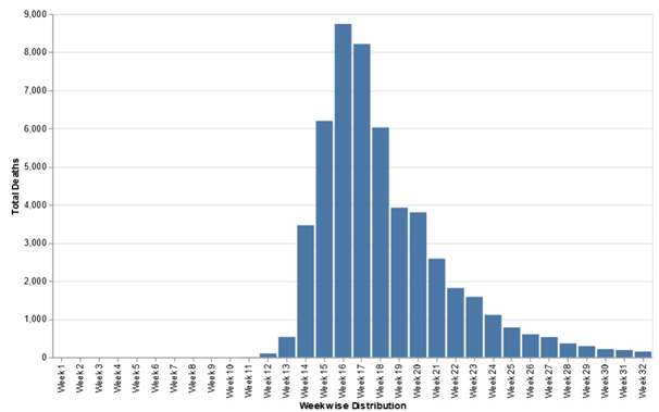
Figure 1 COVID-19 deaths in United Kingdom (Week wise Distribution, Bar Chart)
For line graph:
16. vegalite({
data: {values: as_json},
width: 700,
height: 400,
mark:"line",
encoding: {
x: {title:"Weekwise Distribution","field": "week", "type": "ordinal", sort:null},
y: {title:"Total Deaths","field": "death", "type": "quantitative"},
tooltip: {"field": "death", "type": "quantitative"}
})
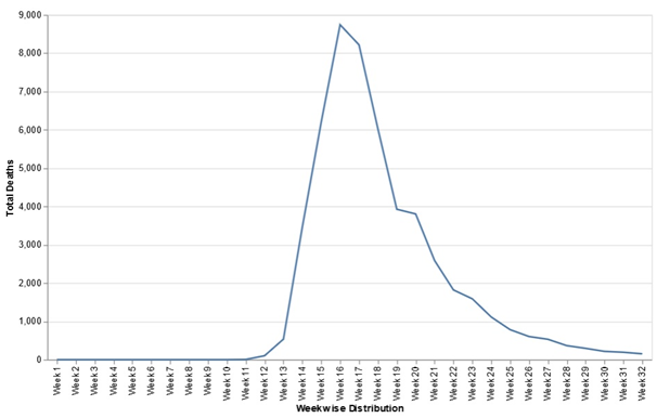
Figure 2COVID-19 deaths in United Kingdom (Week-wise Distribution, Line Chart)
COVID-19 deaths in United Kingdom (Regionwise Distribution)
Code:
1. md`# COVID-19 deaths in United Kingdom (Regionwise Distribution)`
2. xlsx = require('https://bundle.run/xlsx@0.14.1')
3. viewof binary = html`inside input tag "input type=file"`
4. input = new Uint8Array(await Files.buffer(binary))
5. wb = xlsx.read(input, {type: 'array'})
6. ws = wb.Sheets[sheet_name]
7. headers = Object.keys(xlsx.utils.sheet_to_json(wb.Sheets[sheet_name])[0])
8. as_json = xlsx.utils.sheet_to_json(ws)
9. import {checkbox, text, select} from '@jashkenas/inputs'
10. import {table} from "@tmcw/tables"
11. viewofsheet_name = select({options: wb.Sheet Names, title: 'Sheet name'})
12. vegalite = require('@observablehq/vega-lite')
13. vegalite({
data: {values: as_json},
width: 700,
height: 400,
mark:{"type": "bar", "cornerRadiusEnd": 4},
encoding: {
x: {title:"RegionwiseDitribution","field": "Region", "type": "ordinal", sort:null},
y: {title:"TotalDeaths","field": "Deaths", "type": "quantitative"},
tooltip: {"field": "Deaths", "type": "quantitative"},
color:{value:"#ff8333"}}
})
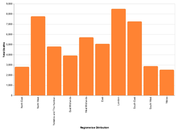
Figure 3COVID-19 deaths in United Kingdom (Region-wise Distribution)
COVID-19 deaths in United Kingdom (Age-wise Distribution)
Code:
1. md`# COVID-19 deaths in United Kingdom (Agewise Distribution)`
2. xlsx = require('https://bundle.run/xlsx@0.14.1')
3. viewof binary = html`inside input tag "input type=file"`
4. input = new Uint8Array(await Files.buffer(binary))
5. wb = xlsx.read(input, {type: 'array'})
6. headers = Object.keys(xlsx.utils.sheet_to_json(wb.Sheets[sheet_name])[0])
7. ws = wb.Sheets[sheet_name]
8. as_json = xlsx.utils.sheet_to_json(ws)
9. import {checkbox, text, select} from '@jashkenas/inputs'
10. import {table} from "@tmcw/tables"
11. viewofsheet_name = select({options: wb.SheetNames, title: 'Sheet name'})>
12. vegalite = require('@observablehq/vega-lite')
13. vegalite({
data: {values: as_json},
width: 700,
height: 400,
mark:{"type": "bar"},
encoding: {
x: {title:"Agewise Ditribution","field": "Age Group", "type": "ordinal", sort:null, "stack": "normalize"},
y: {title:"Total Deaths","field": "Deaths", "type": "quantitative"},
tooltip: {"field": "Deaths", "type": "quantitative"},
color: {"field": "Gender", "type": "nominal"}
}
})
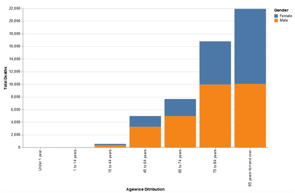
Figure 4COVID-19 deaths in United Kingdom (Age-wise Distribution)
COVID-19 Infections in United Kingdom
Code:
1. md`# COVID-19 Infections in United Kingdom`
2. xlsx = require('https://bundle.run/xlsx@0.14.1')
3. viewof binary = html`inside input tag "input type=file"`
4. input = new Uint8Array(await Files.buffer(binary))
5. wb = xlsx.read(input, {type: 'array'})
6. ws = wb.Sheets[sheet_name]
7. headers = Object.keys(xlsx.utils.sheet_to_json(wb.Sheets[sheet_name])[0])
8. as_json = xlsx.utils.sheet_to_json(ws)
9. import {checkbox, text, select} from '@jashkenas/inputs'
10. import {table} from "@tmcw/tables"
11. viewofsheet_name = select({options: wb.SheetNames, title: 'Sheet name'})
12. vegalite = require('@observablehq/vega-lite')
13. vegalite({
data: {values: as_json},
width: 700,
height: 400,
mark:{"type": "bar", "cornerRadiusEnd": 4},
encoding: {
x: {title:"RegionwiseDitribution","field": "Region", "type": "ordinal", sort:null},
y: {title:"TotalInfections","field": "Infected", "type": "quantitative"},
tooltip: {"field": "Deaths", "type": "quantitative"},
color:{value:"#33ceff"}
}
})
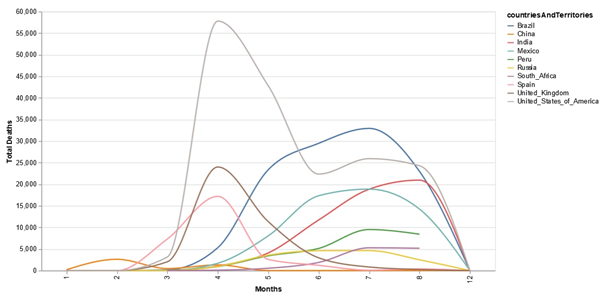
Figure 5COVID-19 Infections in United Kingdom
COVID-19 Wordwide Deaths
Code:
1. md`# COVID-19 Wordwide Deaths`
2. xlsx = require('https://bundle.run/xlsx@0.14.1')
3. viewof binary = html`inside input tag "input type=file"`
4. input = new Uint8Array(await Files.buffer(binary))
5. wb = xlsx.read(input, {type: 'array'})
6. ws = wb.Sheets[sheet_name]
7. headers = Object.keys(xlsx.utils.sheet_to_json(wb.Sheets[sheet_name])[0])
8. as_json = xlsx.utils.sheet_to_json(ws)
9. import {table} from "@tmcw/tables"
10. import {checkbox, text, select} from '@jashkenas/inputs'
11. viewofsheet_name = select({options: wb.SheetNames, title: 'Sheet name'})
12. vegalite = require('@observablehq/vega-lite')
13. vegalite({
data: {values: as_json},
width: 700,
height: 400,
mark:{type:"line", "interpolate": "monotone"},
transform: [
{
"filter": {
"field": "countriesAndTerritories",
"oneOf": ["United_Kingdom", "China", "India", "United_States_of_America",
"Brazil", "Russia", "South_Africa", "Peru", "Mexico", "Spain"]
}
}],
encoding: {
"x": {title:"Months","field": "month", "type": "nominal","scale": {"zero": false}},
"y": {title:"TotalDeaths",aggregate:"sum","field": "deaths", "type": "quantitative"},
"color": {"field": "countriesAndTerritories", "type": "nominal"}
}
})
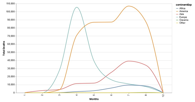
Figure 6COVID-19 Word wide Deaths
COVID-19 Deaths (Continents)
Code:
1. md`# COVID-19 Wordwide Deaths`
2. xlsx = require('https://bundle.run/xlsx@0.14.1')
3. viewof binary = html`inside input tag "input type=file"`
4. input = new Uint8Array(await Files.buffer(binary))
5. wb = xlsx.read(input, {type: 'array'})
6. ws = wb.Sheets[sheet_name]
7. headers = Object.keys(xlsx.utils.sheet_to_json(wb.Sheets[sheet_name])[0])
8. as_json = xlsx.utils.sheet_to_json(ws)
9. import {table} from "@tmcw/tables"
10. import {checkbox, text, select} from '@jashkenas/inputs'
11. viewofsheet_name = select({options: wb.SheetNames, title: 'Sheet name'})
12. vegalite = require('@observablehq/vega-lite')
13. vegalite({
data: {values: as_json},
width: 700,
height: 400,
mark:{type:"line", "interpolate": "monotone"},
encoding: {
"x": {title:"Months","field": "month", "type": "nominal","scale": {"zero": false}},
"y": {title:"TotalDeaths",aggregate:"sum","field": "deaths", "type": "quantitative"},
"color": {"field": "continentExp", "type": "nominal"}
}
})
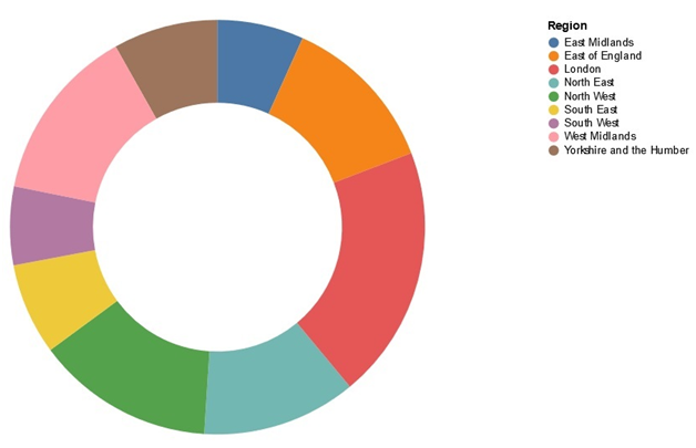
Figure 7COVID-19 Deaths (Continents)
Percentage of individuals ever testing positive for antibodies (unweighted) by region
Code presented in the following section of data visualization assignment:
1. md`# COVID-19 Wordwide Deaths`
2. xlsx = require('https://bundle.run/xlsx@0.14.1')
3. viewof binary = html`inside input tag "input type=file"`
4. input = new Uint8Array(await Files.buffer(binary))
5. wb = xlsx.read(input, {type: 'array'})
6. ws = wb.Sheets[sheet_name]
7. headers = Object.keys(xlsx.utils.sheet_to_json(wb.Sheets[sheet_name])[0])
8. as_json = xlsx.utils.sheet_to_json(ws)
9. import {table} from "@tmcw/tables"
10. import {checkbox, text, select} from '@jashkenas/inputs'
11. viewofsheet_name = select({options: wb.SheetNames, title: 'Sheet name'})
12. vegalite = require('@observablehq/vega-lite')
13. vegalite({
data: {values: as_json},
width: 600,
height: 400,
"mark": {"type": "arc", "innerRadius": 120},
"encoding": {
"theta": {"field": "% testing positive for COVID-19 antibodies", "type": "quantitative"},
"color": {"field": "Region", "type": "nominal"},
"tooltip": {"field": "% testing positive for COVID-19 antibodies", "type": "quantitative"}
},
"view": {"stroke": null}
})
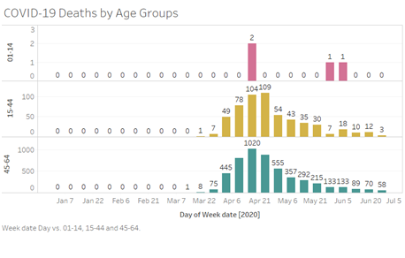
Figure 8 Percentage of individuals ever testing positive for antibodies (unweighted) by region
Visualizations in Tableau
Data Acquisition
About COVID-19, accurate data assets are essential because of the pace at which changes are taking place. The medical research community has been challenged to continue. It is stated in the data visualization assignment that the global science group is given these publicly accessible databases to generate fresh perspectives, whereas the country is contesting COVID-19. The Visual Dashboard Dataset, managed by the Johns Hopkins Centre in Systems Science and Engineering (JHU CSSE), is a data repository for a coronavirus visual dashboard. This has been commonly employed by many organizations to track the global spread of the virus outbreak. ESRI Living Atlas Group and the Johns Hopkins University Applied Physics Lab (JHU APL) both endorse this dataset. In response to the COVID-19 pandemic, the COVID-19 Open Research Dataset (CORD-19) has been developed by the Allen Institute for AI, the White House, and a group of top research groups. CORD-19 consists of over 47,000 publications on the topic, including about COVID-19, SARS-CoV-2, and related coronaviruses, over 36,000 full texts. The CORD-19 dataset is the most comprehensive machine-readable repository of data mining-ready coronavirus literature. In conjunction with the White House Office of Science and Technology Policy in the US, The Allen Institute developed this dataset for AI, in partnership with the Microsoft Research Group, the Centre of Défense and Emerging Technologies, Chan Zuckerberg Initiative and National Institutes of Health.
The WHO also gathers the latest scientific findings and knowledge on COVID-19 and organizes it into a database. WHO regularly reviews the collection from bibliographical research discovery and manual review of the related medical journals' tables of contents and the inclusion of specific medical appropriate papers? The database entries are not corrected or supplemented daily with further research on data visualization assignment. The BSTI has developed and deployed an anonymous, encrypted Web portal to submit and refer pictures of confirmed cases from COVID-19 connected with the Imaging Cloud Technology of Cimar United Kingdom. BSTI aims to provide the UK patient experiences for guidance and training an analogy foundation. The aim is to promptly disseminate clinical and diagnostic information to health professionals in the United Kingdom. Also provides the archive of the COVID-19 recorded events of Chest X-Scans or CT scans and photos by Lan Dao, Joseph Paul Cohen, and Paul Morrison from the University of Montreal. The archive comprised pictures from publications and was published in this GitHub project publicly. The researchers state that the goal is to use such photos to help predict and interpret the infection in AI-based approaches.
This archive contains an endless list, which started on 28 January 2020, of tweet IDs relevant to the current coronavirus COVID-19 (SARS-CoV-2). Using the Twitter API Search for old seven-day tweets, Emily Chen of the University of South California has found the first tweets in a dataset datum up to 22 January 2020. The streaming API of Twitter was used to monitor individual accounts and capture real-time tweets about similar keywords. The dataset considered in the data visualization assignment is only released online with the message Identifiers of the messages received for use in non-profit work following Twitter's service conditions (Bannister-Tyrrellet al., 2020). Laboratories worldwide produce and exchange genome sequences of how-19, clinical and epidemiological evidence from GISAID for the novel coronavirus. The hCoV-19 genome sequences are essential for generating, analyzing, monitoring, diagnostic tests, and recognizing potential therapies. GISAID promotes a worldwide exchange of all courses of influenza viruses and associated health and epidemiological knowledge specific to human viruses to assist researchers.
The research on data visualization assignment illustrates that the quantity and complexity of data accessible are growing quickly and exponentially. In many formats, there is a broader range of information available, such as audio, video, computer logs, shopping, sensors, and social networking sites (Shne iderman and Plaisant, 2010). This has produced significant data that is widely available, often unstructured, in real-time. Around the same period, innovative data analysis approaches are continuously being built to optimize the importance of Large Data and other data sources. Big data is a significant theme. Being the biggest official statistics provider in the UK, ONS seeks to recognize the effect on our statistical systems and outcomes. Our extensive data department discussed the benefits and disadvantages of utilizing alternate data sources and computer analysis methods for official reports. Projects include web-based price exploration, machine-based address learning, and natural language processing for text survey response coding (Anast as sopoulouet al., 2020). The department collaborates directly with the ONS Information Science Campus and engages in the government's comprehensive data technology collaboration. The outcomes of our research on data visualization assignment are frequently reported, and occasionally we communicate about it. You will find some of our files on our Github.io website, which includes a couple of our software, the Download portion of this page, and a full list.
ONS is only interested in trends, patterns, and no personal information on individuals to generate statistical data using alternative data sources. Yet the ONS acknowledges that it is essential to pose questions regarding protection and privacy when collecting data from private or internet pages. ONS assures that all our practice follows the regulatory standards and our responsibilities under the Official Statistics Code of Practice in full. ONS frequently operates with the Information Ethics Advisory Committee of the National Statistician to discuss ethical problems related to the usage of official statistics of all kinds of data sources. In official statistics, for example, ONS developed guidance on web scraping. We used the dataset from ONS which has provisional counting of the number of deaths recorded by, in the last weeks; statistics are collected in England and Wales, by age, sex, and region. The newly available evidence for coronavirus deaths (COVID-19) is available in this dataset. We also acquired the WHO global COVID-19 dataset.
Data Pre-processing
The first dataset we acquired from ONS in order to develop this data visualization assignment had provisional counting of the number of deaths recorded by, in the last weeks; statistics are collected in England and Wales, by age, sex, and region. The newly available evidence for coronavirus deaths (COVID-19) was available in this dataset. The data was presented in a presentation format and was not readily interpreted by the Tableau software (Watts, 2017). Therefore, the data had to be cleaned and pre-processed. The original data was in form a worksheet of Microsoft Excel, so we used Microsoft Excel to extract the parameters of interest and perform the transpose operation which was needed. Then the new worksheet was imported, and the Tableau software and analysis was performed (Jang, 2018). The second dataset we acquired from WHO had global evidence for coronavirus deaths (COVID-19)available in the dataset. The data was presented in a comma separated format and was readily interpreted by the Tableau software. Therefore, the data was not required to be cleaned and pre-processed. The original data was in form a CSV text file, so we imported it in the Tableau software and analysis was performed in the present context of data visualization assignment.
Data Analysis and discussion
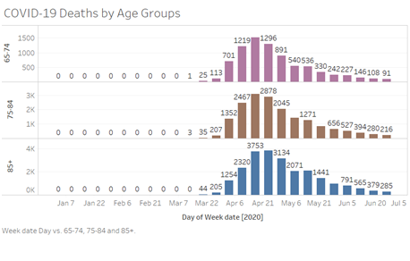
Figure 9 The chart above provided in the data visualization assignment was generated using the Tableau software using the ONS data on the COVID-19 deaths in the UK classified by age groups in the dimension of week. First three age groups are shown in the chart. (Reference: Original content by learner, screenshot attached)
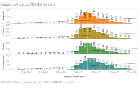
Figure 10 The chart above provided in the data visualization assignment was generated using the Tableau software using the ONS data on the COVID-19 deaths in the UK classified by age groups in the dimension of week. Second three age groups are shown in the chart. (Reference: Original content by learner, screenshot attached)
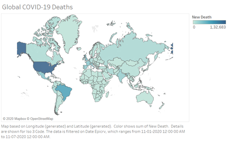
Figure 11The above chart provided in this data visualization assignment was generated using the Tableau software using the ONS data on the COVID-19 deaths in the UK classified by the countries of UK in the dimension of week. (Reference: Original content by learner, screenshot attached)
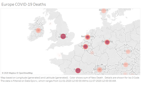
Figure 12 The above chart provided in the data visualization assignment was generated using the Tableau software using the WHO data on the COVID-19 deaths in the whole world classified by the countries. (Reference: Original content by learner, screenshot attached)
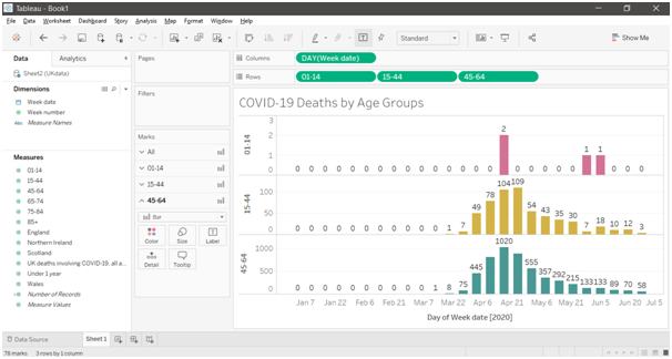
Figure 13Theabove chart depicted in the data visualization assignment was generated using the Tableau software using the WHO data on the COVID-19 deaths in the whole world classified by the European countries. (Reference: Original content by learner, screenshot attached)
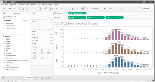
Figure 14Herein data visualization assignment, the chart above was generated using the Tableau software using the ONS data on the COVID-19 deaths in the UK classified by age groups in the dimension of week. First three age groups are shown in the chart.

Figure 15 Herein data visualization assignment, the chart above was generated using the Tableau software using the ONS data on the COVID-19 deaths in the UK classified by age groups in the dimension of week. Second three age groups are shown in the chart.
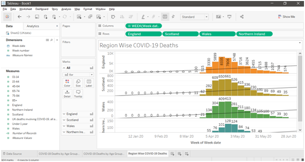
Figure 16The chart above provided within the data visualization assignment was generated using the Tableau software using the ONS data on the COVID-19 deaths in the UK classified by the countries of UK in the dimension of week.
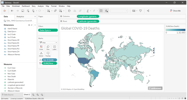
Figure 17The chart above provided in the data visualization assignment was generated using the Tableau software using the WHO data on the COVID-19 deaths in the whole world classified by the countries.
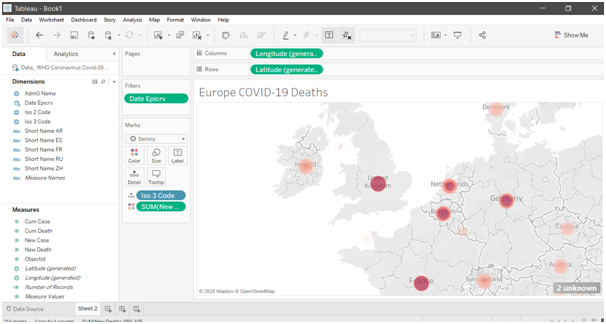
Figure 18Within this data visualization assignment, the chart above was generated using the Tableau software using the WHO data on the COVID-19 deaths in the whole world classified by the European countries.
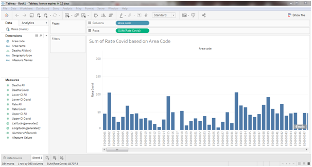
Figure 19Sum of Rate COVID-19 based on Area Code
In the present context of data visualization assignment, the above-mention graph is represented by importing the COVID-19 details of male belonging from different geographical location. The graph is showing the sum of COVID-19 rate in each location separately. It is observed in the data visualization assignment that E090000025 and E09000032 have the highest rate of death in COVID-19.
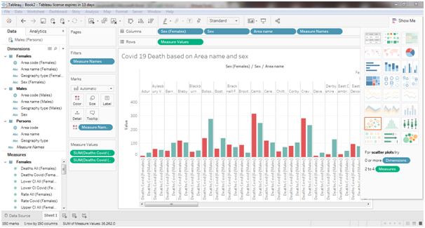
Figure 20 COVID-19 Death based on Area name and Gender
The graph presented in the data visualization assignment is showing the comparison between males and females based on area name. It can be stated that males are more affected by COVID-19 s compare females however in some area’s females are more affected due to COVID-19 virus than males. The comparison between two genders is represented through column chart where X-Axis indicates the area name and Y-Axis is used to represent the death rate of COVID-19 (Angotti, 2017). It indicates the immunity power of females is higher than males against COVID-19.
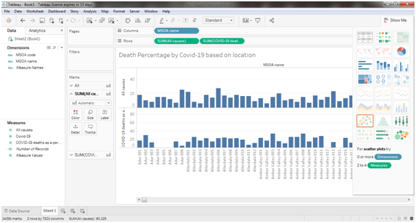
Figure 21 Death Percentage by COVID-19 based on location
In this case of data visualization assignment two graphs are represented simultaneously for showing the different between death due to COVID-19 and death due to other reason. The dataset is classified based on the location and it has been observed that among the all cases most of the people died due to COVID-19 in the resent days. Therefore, the mortality rate has been increased in last 3 to 4 months. For example, 17 out of the 18 deaths are categorized under covid-19.
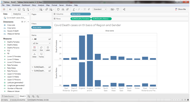
Figure 22COVID-19 Death cases on the basis of Region and Gender
The analysis result of above mention two graphs obtained in this data visualization assignment is used to describe the COVID-19 death rate of males and females based on different region in the United Kingdom. The graph is depicting the comparison between males and females death rate for a particular region. Two graphs are presented by using column chart that include region name in X-Axis and Death rate values in Y-Axis separately for males and females (Biuk-Aghaiet al., 2017). As discussed earlier, the death rate of male is exponentially increasing in every region over the UK.
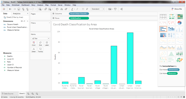
Figure 23COVID-19 death classification by Area
Herein data visualization assignment, the graph is showing the COVID-19 death rate by considering the information of rural and urban area in the UK. The graph is clearly described that the percent of rural areas are less affected rather than urban area. For example, the major community in urban area provides more death cases as urban areas are more congested and people are not maintaining social distancing during this pandemic situation. Due to this reason the death rate is enhance day by day in urban areas. Apart from that, the population in rural area is less and people in rural area are more aware regarding the consequence of COVID-19 and they are maintaining the social distance to reduce the chances of increasing death rate.
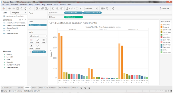
Figure 24-19 death cases based on March month
In the above graph provided in the data visualization assignment includes three separate sections such as all cases death rate, COVID-19 death rate and Non COVID-19 death rate. Again, each section given in this data visualization assignment is classified in to other three section Males, Females and Total Persons based on area. It can be stated in the month of march the cases of COVID-19 is very less than non-COVID-19 cases as this is the initial month from which the COVID-19 cases are observed in the different regions of the UK.
Figure 25COVID-19 death cases based on April month
In the graph presented in the above context of data visualization assignment includes three separate parts that are all cases death rate, COVID-19 death rate and Non COVID-19 death rate. It is also divided by considering both genders accordingly. Here the death rate of April month is increase slightly from the previous month. The graph is also showing comparison between three different cases based on the different region along with the gender.
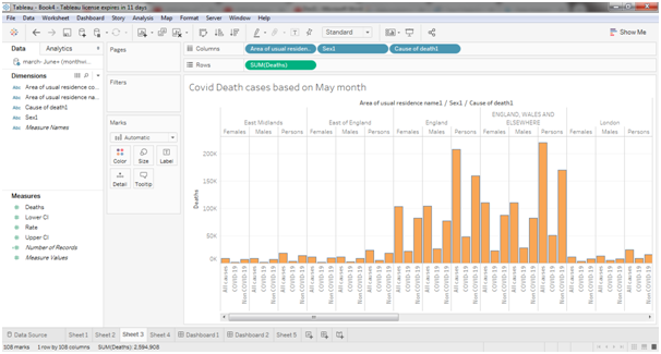
Figure 26COVID-19 death cases based on May month
Now this graph presented in the data visualization assignment is responsible for displaying how the COVID-19 death cases are increased in May month as compare to previous two months. From the graphical representation it is observe that the rate has been increased by approximate 10% of the death rate of previous month. The reason behind this is that the pandemic situation is increasing every day and affected more than 1000 people per day that causes higher mortality rate in the United Kingdom.
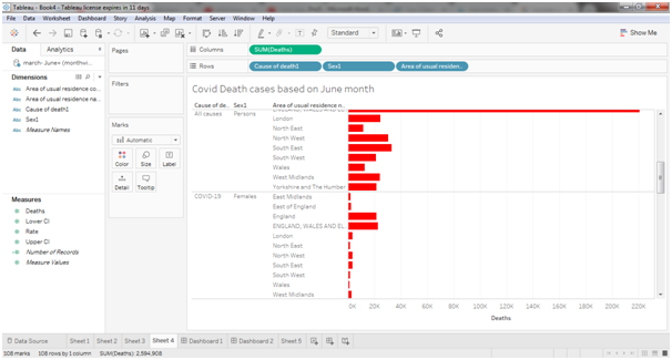
Figure 27COVID-19 death cases based on June month
From the analysis of March, April and May months done in the data visualization assignment it can be easily understood that the nature of graph is increasing day by day. In the same manner the infection cases of June monthhas been increasing as it is as infectious disease and spread among the people easily but the death rate decreased. For example, the death rate of England in May month is 11K and in June Month 3.5K. Due to the implementation of lockdown and different prevention strategy for save the people over the UK.
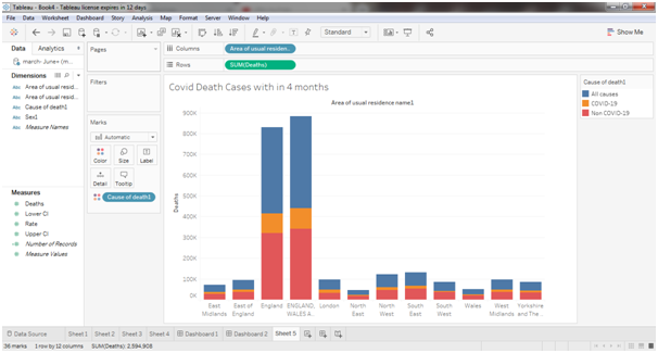
Figure 28COVID-19 death cases between March to June
This graph is representing the combine result of 4 months as per the region. From the graph England, Wales and Elsewhere has more COVID-19 cases rather that other location. The main reason behind is that the location consist of more people that easily increases the number of COVID-19 cases.
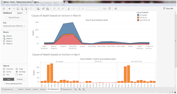
Figure 29Cause of death based on location in March and April months
Herein data visualization assignment, the above graph is analyzing the COVID-19 death cases and Non COVID-19 death cases based on location. Here the graph shown that in the crowded location this COVID-19 was spreading very fast. For this reason In the United Kingdom visiting country and business country was very much affected due to COVID-19. But due to Lockdown situation was handled and now it is very normal. The death rate was increased day by day in all locations. The graph shows the death rate is increased in the month of April compare to the March month. For Example, England is very crowd country that’s why in this country COVID-19 death cases are also high.
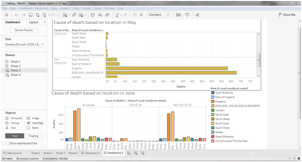
Figure 30Cause of death based on Location in May and June months
Above graph presented in the data visualization assignment shown the analysis the COVID-19 death cases from all death cases in May and June month based on location. Due to lockdown in all over UK there is unbelievable decrease in death rate after the April month. Here the graph shown that the growth rate of death is only high in April month after that it is growing downwards. For example, in England the total death in March was 9.1K, in April it was 58K but after that the rate growing downwards. In May it was 22.4K and in June it was 6.2K. It is clearly shown that the death rate was decreasing day by day.
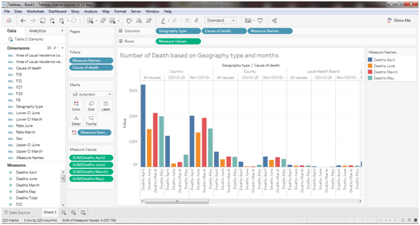
Figure 31 Numbers of Death based on Geography type and Month
The analysis on the above graph done in this section of data visualization assignment shows the death rate between 4 months (March, April, May and June) based on Geography type like Country, County, Metropolitan County, Non-Metropolitan County etc and Cause of Death. It is clearly showing that the death rate of COVID-19 is higher in Metropolitan County and Country than any other geographical types. The Comparison between these months is observed clearly from the above-mentioned graphical representation within this data visualization assignment. For example, in the March month the number of COVID-19 death was 18K, in April it was 1.2 Lakhs. Therefore, here is huge different in the month of March and April. But after that it was decreasing.
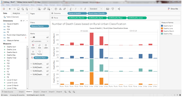
Figure 32 Number of Death cases based on Rural and Urban Classification
The above graph depicted in the data visualization assignment shows differences between the COVID-19 death cases in different months in rural areas and urban areas. The graph clearly shows that in urban areas’COVID-19 death cases are more than the rural areas. However, it is shown that death cases in April month is very high rather than any other months. For example, in the rural area death cases on April month is 2.2K and the urban area death cases are 12.2K but it is higher than other months.
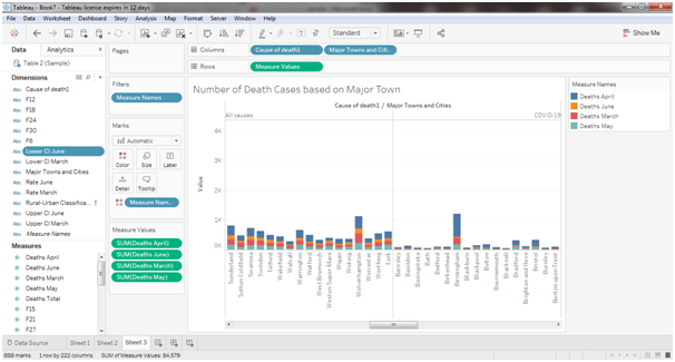
Figure 33 Number of Death cases based on Major Town
The graph is representing the death cases in COVID-19 on the month of March, April, May and June in the major towns in United Kingdom. From the analysis on above graph conducted in this segment of data visualization assignment it is clearly shown that the COVID-19 death cases are very high in some of the major cities. For example, in Birmingham Death cases in March month was 1.08K, In April it was 16.6K, in May it was 838 and in June it was 566. It is clearly shown that in June month death rate of all cases and also COVID-19 cases are decreasing day by day in UK’s major cities and at the end it will be decline.
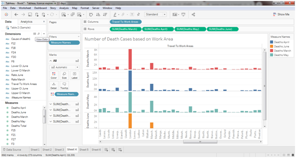
Figure 34 Number of Death cases based on Work Area
The graph shown in the data visualization assignment is representing the death cases in COVID-19 on the basis of Work area. London, Liverpool, Manchester etc, are the major work location where the COVID-19 cases are high rather than other areas and the death rate is also high. It is shown that in the Work location death cases are very much lower than the major town as in the town there are some crowed places like market. Due to lockdown the work places are closed for long days that are why in these locations people are not available on that time. For example, in London the death cases were approximately 8k in March, 16k in April, 5K in May and 3K in June months.
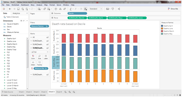
Figure 35 Death rate based on Decile
The above graph representing the death cases based on Decile and months. Herein data visualization assignment,Decile 1 is representing as most deprived and Decile 10 is represented as least deprived. The death cases in month of April are higher than other months. The death rate is higher when the deprived level is high and the death rate is low when the deprived level is low. In the June month the rate of death is lower. For Example, the number of deaths was approximately 20K in the most deprived and 17K in the least deprived in the month of March.
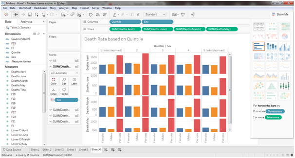
Figure 36Death Rate based on Quintile
The above graph representing the death cases based on Quintile and months. Herein data visualization assignment, Quintile 1 is representing as most deprived and Quintile 5 is represented as least deprived. The death cases in month of April are higher than other months. The death rate is higher when the deprived level is high and the death rate is low when the deprived level is low. In the June month the rate of death is lower. For Example, the number of deaths was approximately 3K in the most deprived and 3K in the least deprived in the month of April.
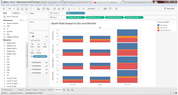
Figure 37Death Rate based on Sex and Months
The above figure mentioned in the data visualization assignment classified theCOVID-19 death cases based on Gender in between March to June month. The picture clearly shows that males’ death percentages are higher than the females. In April month the death case is higher than other months. Total number of deaths in every month is same for males and females but the COVID-19 death cases of males are higher than the females. For example, number of death cases in COVID-19 is approximately 8 hundred for male and 6 hundreds for females.
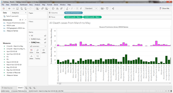
Figure 38All Death cases from March to May
The above graph provided in the data visualization assignment representing the death cases during the period of March to May months. Generally, the death cases are very high in United Kingdom that is clearly shown in the graph. COVID-19 death cases are very high in the urban area. As in the urban area there are many crowed places. But here Non COVID-19 death cases are higher than the COVID-19 cases. So, the graph proved that death rate in United Kingdom is high.
Difference between Observable HQ and Tableau
Both the tools noted in the data visualization assignment have their own advantages over each other in some or the other way. Where ObservableHQ is online tool, user never has to install it in native machine; Tableau is a bit heavy tool that should be downloaded and installed in native machine which in turn takes storage to execute.
Additionally, Observable HQ is free and open source software which is one signup away. On the other hand, Tableau is available free for trial but once the trial period ends, pay is needed to continue usage.
Observable HQ tool has its predefined set of syntax and functions to be learned prior to generate graphs and visualizations. However, Tableau is a tool that does not require any line of code, user just has to drag and drop and make few clicks to generate graphs. Tableau is easy to use than Observable HQ.
On the performance front, Tableau is faster than Observable HQ. The speed of Observable HQ identified in the data visualization assignment is also dependent on speed of network from where user is using the tool as it is online; user has to depend on network for data graph generations. Tableau is at the machine and hence, internet speed cannot affect the speed of tool. Moreover, while dealing with huge data, Observable HQ takes few seconds to load it if excel is imported at runtime. From the overall discussion done in this segment of data visualization assignment it can be concluded that speed of Tableau is better than that of Observable HQ.
When it comes to accuracy, both Observable HQ and Tableau are most accurate in generating results. Some aggregations are required such as sum, mean, etc. while generating graphs; it was observed that both the tools are on similar rank top in terms of accuracy.
CONCLUSIONS
The study prepared in the data visualization assignment discussed the effect of coronavirus over the United Kingdom along with different countries in the UK. The researcher has collected dataset associated with Covid19 in the United Kingdom from the official “national statistics websites”. The dataset includes different variations of data and organized the data based on the gender, region and other relevant factors. The visualizations were performed in both Observable HQ and Tableau tool. Observable HQ tool is an open source tool for which user needs a web browser and good internet connection. For most of the graphs, coding in observable is tedious and is too time consuming if user is naïve. With the help of Tableau tool, the researcher has represented the collected information in different graphical format. Separate graph is created for showing separate information based on some detailed factors. The research on data visualization assignment also analyzed the death rate of people in the UK due to COVID-19 based on their gender, area code and different regions. The analysis also showed how many people are infected in the particular region. The data is also represented based on the month as the starting month of COVID-19 diseases in the UK is March therefore it is concluded that a huge difference is observed between the death rate of March, April, May and June. The death rate is increased in April from the previous month however the death rate is decreased in the next month’s gradually as the United Kingdom along with their countries have strictly followed the lock down period and social distancing. It is also observed that, the female are less affected as compared to male in every separate region of the UK. Moreover, the urban areas are more injured due to coronavirus and the death rate of urban areas is very high rather than rural area. The urban areas are more congested and they are not properly maintained the social distancing to avoid the chances of covid-19. Finally, the death rate of covid-19 can be reduced by following the proper social distancing and maintaining the rules and regulations against corona virus.
Using both Tableau and Obser vable HQ for different analysis was a good learning experience but from differences listed in the previous section of data visualization assignment, it is always a good practice to learn something challenging. If asked from the two, ObservableHQ is highly recommended for its economical reasons as well as from the learning perspective. ?
References
Akhtar, N., Tabassum, N., Perwej, A.,&Perwej, Y. (2020).Data Analytics and Visualization using Tableau Utilitarian for COVID-19 (Corona Virus).Data visualization assignmentGlobal Journal of Engineering and Technology Advances.03(02). p. 028–050.
Anastassopoulou, C., Russo, L., Tsakris, A., &Siettos, C. (2020).Data-based analysis, modelling and forecasting of the COVID-19 outbreak. PLOS ONE, 15(3), e0230405. https://doi.org/10.1371/journal.pone.0230405
Angotti, R.(2017). Dynamic Displays of Data. The Mathematics Teacher, 110(9), pp.703-707.
Bannister-Tyrrell, M., Meyer, A., Faverjon, C., & Cameron, A. (2020). Preliminary evidence that higher temperatures are associated with lower incidence of COVID-19, for cases reported globally up to 29th February 2020. In med Rxiv. Cold Spring Harbor Laboratory Press.
Shneiderman, B.,&Plaisant, C.(2010). Designing the user interface: strategies for effective human-computer interaction.Pearson Education India.
Biuk-Aghai, R.P., Pang, P.C.I.,& Pang, B. (2017).August. Map-like visualisations vs. tree maps: an experimental comparison. In Proceedings of the 10th International Symposium on Visual Information Communication and Interaction (pp. 113-120).
Giordano, G., Blanchini, F., Bruno, R., Colaneri, P., DiFilippo, A., Di Matteo, A., &Colaneri, M. (2020). Modelling the COVID-19 epidemic and implementation of population-wide interventions in Italy. Nature Medicine. https://doi.org/10.1038/s41591-020-0883-7
Jang, D.H. (2018). Data visualization education using the storytelling with Minard's figurative map. The Korean Journal of Applied Statistics, data visualization assignment31(2), pp.167-188.
Khanam, F. K., Nowrin, I.,&Mondal, M. R. H. (2020).Data Visualization and Analyzation of COVID-19.Journal of Scientific Research and Reports.26(3).p.42-52.
Kosara, R., Fitzgerald, B., Rosling, H., Sack, W., &Viégas, F.B. (2007). Panel: The impact of social data visualization. In IEEE visualization conference compendium (pp. 128-130).
Ruan, Q., Yang, K., Wang, W., Jiang, L., & Song, J. (2020). Clinical predictors of mortality due to COVID-19 based on an analysis of data of 150 patients from Wuhan, China. Intensive Care Medicine, 1–3. https://doi.org/10.1007/s00134-020-05991-x
Volpert, V., Banerjee, M., d’Onofrio, A., Lipniacki, T., Petrovskii, S., & Tran, V. C. (2020). Coronavirus – Scientific insights and societal aspects. Mathematical Modelling of Natural Phenomena, 15, E2. https://doi.org/10.1051/mmnp/2020010
Watts, G. (2017). Hans Rosling. The Lancet, 389(10070), 694.
Weber, A., Ianelli, F.,&Goncalves, S. (2020). Trend analysis of the COVID-19 pandemic in China and the rest of the world. Data visualization assignment ArXiv:2003.09032 [q-Bio]. https://arxiv.org/abs/2003.09032