
Responsive Web Design: A Case study of National Geographic Website
Question
Task:
Select and undertake an in-depth evaluation of the following website:
Website: http://www.nationalgeographic.com.au/
Upon the completion of the task, you are to provide a formal report documenting your critical evaluation of the website. The review is to be carried out within the context of responsive web design (RWD) and development principles. The report should draw particular attention to the interactive aspects and design aspects relating to responsiveness of the overall website. Support your critique with appropriate RWD principles.
What to Review: The purpose of the report is to provide a critical evaluation of the nominated website and to support your observations and comments convincingly. The nominated website should be reviewed using Google Chrome’s device simulator. For the purpose and intention of this assessment, use only the device simulator for your reviews. This is to ensure that all students have access to consistent and identical review tools.
Your review of the nominated website must be thorough and sufficiently comprehensive to include 5 different screen displays. The recommended settings are as follows. Students are free to select the different simulated device (in the Chrome device simulator) they would like to use for the reviews.
- Large Display: Generic notebook or desktop with display greater than 1280x768 pixels.
- Medium Display: Any mobile device with display approximately 480x640 to 700x960 pixels, in both landscape and portrait orientation
- Tiny display: Any mobile device with display approximately 200x320 to 400x640 pixels, in both landscape and portrait orientation.
What to Include: Your report should include:
- Clearly identify the nominated website. Provide an overview and description of the nominated website.
- Identify and elaborate the main feature or features of the website.
- Identify the positive and negative aspects of the website. Draw particular attention to the interaction and usability aspects of the interface.
- Invite two other persons to review the nominated website. All reviewers should use identical device settings. These participants can be your friends, family members or classmates etc. Provide the background (i.e. age, gender, profession) of the participants. Do their views differ from yours’? State why or why not.
- Based upon your critique and observation in items (1) to (4) of the above, provide a recommendation on how the website should be improved. Conversely, if it does not require further improvement, then provide the reason why that this is the case.
- Except for item (4) of the above, all assertions relating to RWD design principles (e.g. statements like ‘blue text on red background is a poor colour combination’ ) must be supported by references or critical observation. You can cite additional scholarly references other than the textbook. (Note: Do not use Wikipedia as a source of reference).
- Comment on the tools (i.e. Chrome device simulator) you used for the review. Elaborate on the advantages and disadvantages of such a tool. Search and briefly comment on similar tools available for testing and reviewing RWD web pages.
- Figures or diagrams can be added as needed.
Answer
Introduction: The website web designing is a process by which the designers plan and develop a website that is capable of responding to the behavior of its users and screen sized based environment. It allows the website to appear high-quality irrespective of different devices with different screens. For the purpose of developing responsive web designing, the developer mainly uses the CSS and HTML technology (Kraak & Brown, 2014). This report is commissioned to provide detailed comprehension regarding the various aspects of responsive website designing. For better understanding, the National Geographic website is considered in this report. The mission & vision of this website is to empower the history of the world for people. This particular website comprises of innovation, creativity, and learning so as to enhance the community and developing a better future. For the detailed analysis, various tools such as Google chrome stimulator and other tools are discussed in this report.
1. Discussion of the National Geographic Website: This particular website is highly emphasized on DIY or do it yourself and DIWO or do it with other projects. It can be easily comprehended from the home page of the website itself as it comprises of different articles or videos of various DIY projects. The color selection and combination are also noticeable as the users get attracted to the content. The logo of the National Geographic can be seen at the extreme left corner of the website.
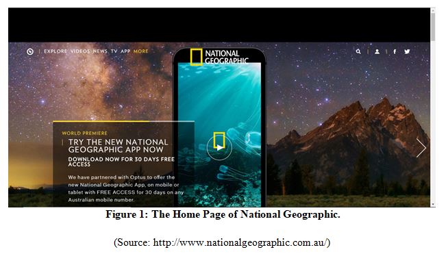
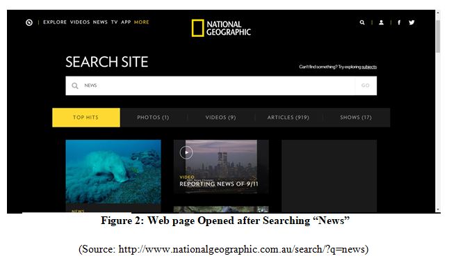
From the above-mentioned figure, it can be seen that the menu is placed in the header of the website. This website also permits the users to login in order to record the activity of each registered users. While clicking on the video, it opens to show the detailed information associated with the videos. Both the registered and non-registered user can get influenced by the website’s mission by the help of link offered in the menu referring as “get involved” (Jensen, 2013). Similarly, there is also a search option at the right upper corner for the convenience of the users. It allows the users to search any topic regarding their interest in craft and technology. For instance, while feeding the name “News”, the following search results can be seen through the web page (fig: 2).
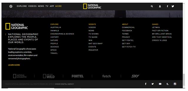
This website has also a footer which comprises of vital links regarding about us, follow us, make share, twitter, youtube, instagram and many more. Each and every project is comprised of an in-depth explanation of the mechanism which enables the users to accumulate idea associated with the raw ingredients which are required projects (Jensen, 2013).
2. Identification and Elaboration of Website Feature
2.1 Main feature: Responsiveness: The responsiveness of the website is considered as its most comprehensive feature. After the thorough analysis of the website, it has been observed that the website can be accessed in any internet enabled devices (Bryant & Jones, 2012). Presently, the majority of the users access their preferred sites over their mobile devices as it provides the convenience of its usages anywhere and anytime. The users of the websites easily access even on the small screen of the mobile devices due to the high-quality responsiveness of the website (Bryant, and Jones, 2012).
2.2 Other features:
- Website Goal: The website effectively portrayed its goals and objectives. The mission has been clearly defined in the “About us” page where the description of the objectives helps in effective interaction with the users.
- Smooth loading of Websites: irrespective of any devices, the website loads smoothly without taking excessive time. This is due to its responsiveness (Jensen, 2013).
- Reaching the target audience: The website is successful in reaching the target audience due to its ways of presenting its media content. If the audience is interested in developing innovative things can relate to the website.
- Highlighting brand image: The website also emphasized to highlight the brand image with the help of its website design and content displayed (Bryant, & Jones, 2012).
3. Identification of Positive and Negative aspects:
3.1 Positive impact:
- Light website design: The light design is considered as the major aspects in the entire design process. The light design also enables the website to load promptly and results in the smooth appearance of the content (Lowry, Wilson, & Haig, 2014).
- Followed Responsive design rather than Adaptive: This respective website follows the responsive design principles rather than adaptive web design principles. It is developed in such a way that it can support any devices.
- Usage of Vector images: While designing the website, the developers have used vector images in order to ensure that the site displays the same quality of images in different screens. Resizing the images and its quality with the help of CSS is also an appropriate process but it is as effective as utilizing vector images (Jensen, 2013).
- Responsive navigation: A responsiveness website has the cutting edge due to its utilization of different pattern of navigation. It enables the users to experience steadiness in the looks, feel and experience of the website (Cyr, Head, & Larios, 2010).
3.2 Negative Impact:
Utilization of PX instead of Percentage: The design module of the website depends on the PX instead of a percentage. The PX effectively works effectively within the responsive websites but it also leads to malfunctioning of the page and resulting in dissatisfaction among the users (Lowry, Wilson, and Haig, 2014).
Lack of flow within the website: The flow during the access to the websites is not so effective. There are ample spaces for rectification in terms of maintaining smooth flow in the website design (Cyr, Head, & Larios, 2010).
4. Review of National Geographic Website:
4.1 Review by participants:
Participant 1: The first participant is a young twenty-three years old male who is familiar with the website design process and works in a small IT company as a freelance website designer. Due to his profession, he understands that a responsive website must perform equally on every device. For reviewing the website, he uses his own iPhone 6s. He observed that the website performs efficiently. The interaction was flawless in every section of the website. He also emphasized upon the fact that the images used within the website is clear especially in the mobile devices and it is a critical factor in a responsive website. While accessing the website on the computer browser, he also found that the website is very light and took no time to load (Sharkie, & Fisher, 2013).
Participant 2: The second participant is a thirty-eight years old lady who works as a departmental head in a private organization. She has gone through the website on a computer. She stated that the website has effectively conveyed its mission and the objectives were very apparent throughout the entire website. As she is very curious and has a keen interest in developing new things, she found that the content of the website is very comprehensible and explicable. The navigation within the site is also effective and apparent. As the website is very light, she can access it even in the low internet speed (Sharkie, & Fisher, 2013).
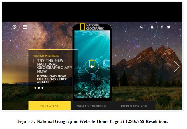
4.2 Using Google Chrome stimulator to analyze the National Geographic Website in different screen:
- 1280X768: The website was analyzed in the screen size of 1280X768. The image is given below:
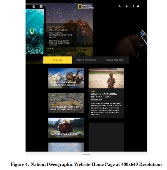
- 480X640: The website was analyzed in the screen size of 480X640. The image is given below:
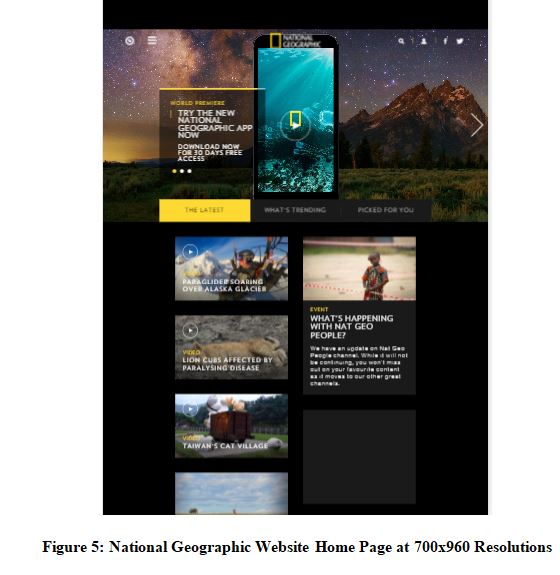
- 700X960: The website was analyzed in the screen size of 700X960. The image is given below:
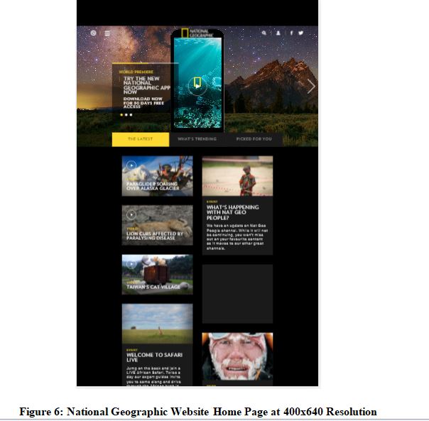
- 400X640: The website was analyzed in the screen size of 400X640. The image is given below:
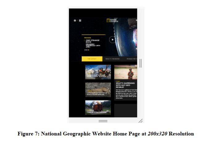
- 200X320: The website was analyzed in the screen size of 400X640. The image is given below:
4.3 Similarity and Dissimilarity in Participants Review: Both the participants are in the favor that the website is effective in representing its mission to its users. The navigation was also effectual and well-organized within the website. Similarly, the images used on the website are also clear in different screen resolution (Scharl, 2012).
According to the review, the major characteristics of the websites match among the participants. It permits the users to interact with the website efficiently. The users can access the websites within no time as it is a lightweight site. Thus, the reviews of both the participants match with each other (Scharl, 2012).
4.4 Google Chrome Simulators: The Google chrome simulators permit the web designer to replicate the mobile devices with the utilization of device mode. It helps the web designer to replicate the website on different devices. Further, it also permits the designer to examine the website in various devices’ screen resolution. Moreover, evaluating the CSS media queries is also probably within the Google chrome simulator (Scharl, 2012).
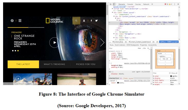
Advantages: Some of the major advantages of Google simulator are:
- Rapid Debugging: The incorporated comfort will direct you to avoid mistake while coding. The most vital element is the capacity to map on the mistake connects and users are notified of a dodgy code (Wang, & Zhang, 2013).
- Easy-to-use: The Google Chrome devices are mainly simple and ideal to explore. The boundary to section is really low despite for those who have little knowledge about it.
- On- The-Fly Style Changes: The Google Chrome simulator helps in examining the specific component on the web page to identify which style is bet suitable for the website. Thus, it allows to the content manager to freely change the composition of the page.
Disadvantages: The disadvantages of Google Chrome Simulators are:
- Improper Results: The outcomes generally vary and are not steady. The appropriate output of a website in the smaller screen may vary in terms of visualization within the Google Chrome simulator (Wang, & Zhang, 2013).
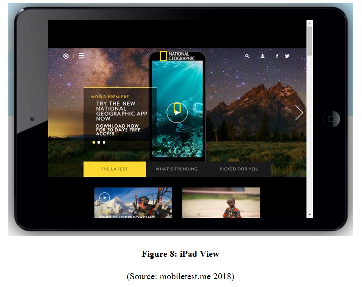
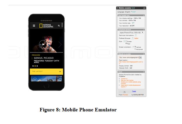
4.5 Description of Other Mobile Device Simulators:
iPad View: This particular site will be effectively tested in one of the most renowned tablets known as iPad. This respective page does not assist any other devices rather than iPad. For accessing the site visit URL: http://mobiletest.me
Mobile Phone Emulator: It is considered as the most efficient and popular phone emulator. The amount of mobile platform which can be replicated within the site is immense. The probability of error in the visualization is relatively lower (Wang, & Zhang, 2013).
5. Recommendations:
Flexible Grid Based layouts: The website will be comprised of the logo, header, navigation, content, body, footer, sidebar content, social links, and copyrights. A fixed grid will be developed at the initial stage. The receptive outline is attached in with relinquishing of a click and identifying to grasp that. The preliminary thing is the study which has to be flexible according to the plan (Weikler, 2016).
Making the Website Flow Efficient: It is highly recommendable to consider various types of navigation during the development of the website. Before the designing of the website, the content references and content inventory wireframes must be framed for the desktop, mobile, and tablet (Weikler, 2016).
Conclusion: From the above-mentioned comprehension, it can be concluded that National Geographic Website is very effective in achieving its goals and objectives. It is very responsive for the medium and big screen and is not suitable for the smaller screen resolutions like 200X320. This particular site has been developed by abiding the principles of RWD. However, the content within the website can be managed effectively so as to make it more structured and visible especially on the smaller screen. In this particular case, it is observed that the developer of National Geographic has implemented “Response Web Design”. The analysis has shown in the preliminary processes which are utilized to develop responsive sites. As the examination comprises of those systems, the investigation can signify that they are appropriately prolific and easy to actualize. In this context, this respective study has efficiently, evaluated the responsiveness of the concerned site. The high dependent upon the Google Chrome simulator is not precise, however, the results obtained from this analysis is dependable enough to draw the conclusion that National Geographic site must enhance its flow more effectively. Similarly, it is equally vital to verify the responsiveness of the site with the help of different sites because every simulator have minimum one flaw which drives its receptiveness.
References:
Bryant, J. & Jones, M., (2012). Responsive web design. In Pro HTML5 Performance (pp. 37-49). Apress, Berkeley, CA.
Cyr, D., Head, M. and Larios, H., 2010. Colour appeal in website design within and across cultures: A multi-method evaluation. International journal of human-computer studies, 68(1-2), pp.1-21.
Jensen, S.S., (2013). Responsive Web Design as a Wicked Problem. In Proceedings of the 9th Student Interaction Design Research Conference (pp. 94-97).
Kraak, J.M. and Brown, A., (2014). Web cartography. CRC Press.
Lowry, P.B., Wilson, D.W. & Haig, W.L., (2014). A picture is worth a thousand words: Source credibility theory applied to logo and website design for heightened credibility and consumer trust. International Journal of Human-Computer Interaction, 30(1), pp.63-93. Mobiletest.me, (2018). http://mobiletest.me/ipad_mini_emulator/?u=http://www.nationalgeographic.com.au/Ipadpeek. [Accessed 14th April, 2018].
Scharl, A. (2012). Evolutionary web development. Springer Science & Business Media.
Sharkie, C. & Fisher, A., (2013). Jump Start Responsive Web Design. SitePoint.
Tips of the Week: ABS Slurry, a., Bay Area, D., From the Whimsical to the Practical: Bots, a., Larry Harvey, O., Grass Applicator, M., & Maker Faire, M. et al. (2018). Home | Make: DIY Projects and Ideas for Makers. Make: DIY Projects and Ideas for Makers. Retrieved 14 April 2018, from https://National Geographic.com/
Wang, H., & Zhang, W. (2013, June). Reform of the Web Design and Construction Teaching. In 2013 Conference on Education Technology and Management Science (ICETMS 2013). Atlantis Press.
Weikler, S. (2016). Web Design for Beginners: The Ultimate Website Beginners Guide. CreateSpace Independent Publishing Platform.
You searched for wi-fi | Make: DIY Projects and Ideas for Makers. (2018). Make: DIY Projects and Ideas for Makers. Retrieved 14 April 2018, from https://National Geographic.com/?s=wi-fi


