
Statistics Assignment: Critical Reasoning For Solving Business Issues
Question
Task:
Purpose:
This statistics assignment aims at Understand various qualitative and quantitative research methodologies and techniques, and other general purposes are:
- Explain how statistical techniques can solve business problems
- Identify and evaluate valid statistical techniques in a given scenario to solve business problems
- Explain and justify the results of a statistical analysis in the context of critical reasoning for a business problem solving
- Apply statistical knowledge to summarize data graphically and statistically, either manually or via a computer package
- Justify and interpret statistical/analytical scenarios that best fits business solution.
Please read below information carefully and respond all questions listed.
Question 1
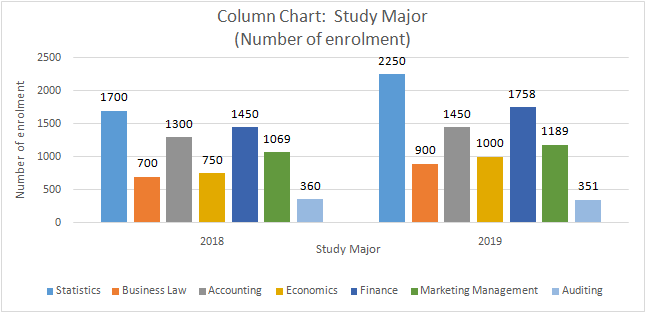
The higher education department of Holmes Institute recorded data on the number of students enrolled in the different study majors for the years 2018 and 2019.
a) Use an appropriate graphical technique or chart to compare the number of enrolments in 2018 and 2019 of the different study majors. Display the chart.
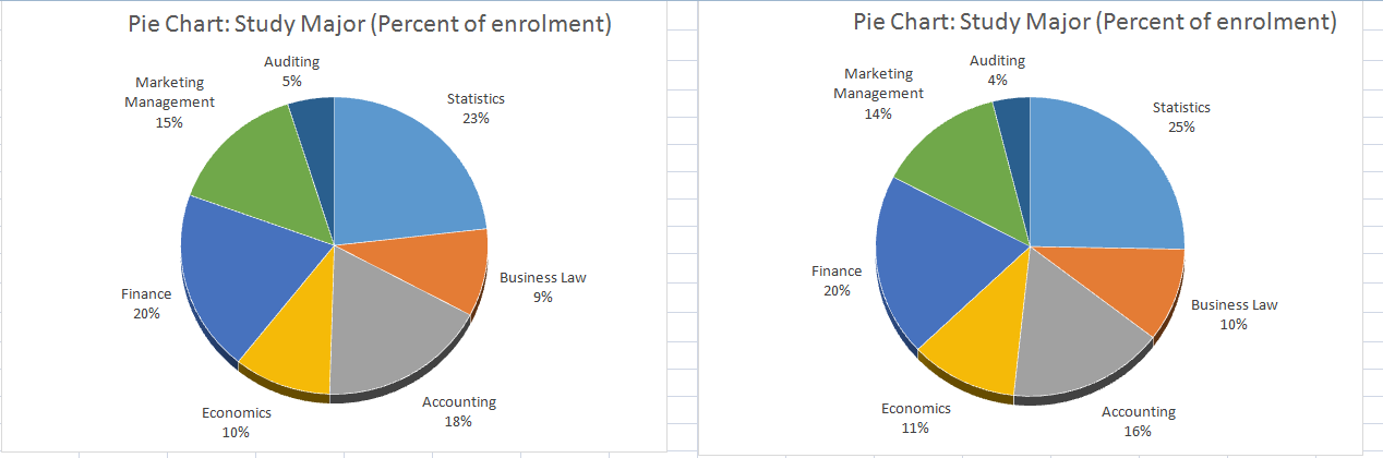
b) Use an appropriate graphical technique or chart to display the percentage value of the number of enrolments of the different study major in 2018 and 2019. Display the chart.
Question 2
Sociologists argued that women on average earn less than men as women often choose to work less hours. They further suggest that the choice of hours worked may be driven by various factors such as age, childcare needs, occupation choice and flexibility. To investigate the relation between hours worked and income earned by Australian men and women, a researcher plans to survey a sample of individuals across the country. Briefly explain (using no more than 250 words in total for this question)
a) What type of survey method the researcher could use and why?
b) What sampling method could the researcher use to select his/her sample and why?
c) What are the two main variables the researcher should consider collecting data for the purpose of the above analysis and why? Identify the data type(s) for the variables.
d) What kind of issues the researcher may face in this data collection?
Suppose a researcher has collected data from a sample of 65 individuals using the sampling method you have proposed in (b). For each individual, the hours worked per week and yearly income (measured in ‘000’s dollars) were recorded.
Question 3
First, the researcher categorised the data into six location groups and six occupation groups, and calculated the frequencies given below.
Using Excel and the data in the frequency tables above, answer the following questions.
- Which graphical technique or chart should be used if the researcher is interested in comparing the number of individuals in each location group? Explain the reason for the selection of this graphical chart. Construct and display the chart, also briefly describe what you can observe about the number of individuals belonging to each location category.
- Which graphical technique or chart should be used if the researcher is interested in comparing the proportion of the number of individuals in each occupation group? Explain the reason for the selection of this graphical chart. Construct and display the chart, also briefly describe what you can observe about the proportion of the number of individuals belonging to each occupation category.
Question 4
Second, the researcher wishes to use graphical descriptive methods to present summaries of the data on each of the two variables: hours worked per week and yearly income.
a) The number of observations (n) is 65 individuals. The researcher suggests using 7 class intervals to construct a histogram for each variable. Explain how the researcher would have decided on the number of class intervals (K) as 7.
b) The researcher suggests using class intervals as 10 < X ? 15, 15 < X ? 20, …, 40 < X ? 45 for the hours per week variable and class intervals 40 < X ? 45, 45 < X ? 50, ..., 70 < X ? 75 for the yearly income variable. Explain how the researcher would have decided the width of the above class intervals (or class width).
c) Draw and display a histogram for each of the two variables using appropriate BIN values from part (b) and comment on the shape of the two distributions.
Question 5
Third, the researcher wishes to use numerical descriptive measures to summarize the data on each of the two variables: hours worked per week and yearly income.
a) Prepare and display a numerical summary report for each of the two variables including summary measures such as mean, median, range, variance, standard deviation, smallest and largest values and the three quartiles. Notes: Use QUARTILE.EXC command to generate the three quartiles.
b) Compute the correlation coefficient using the relevant Excel function to measure the direction and strength of the linear relationship between the two variables. Display and interpret the correlation value.
Question 6
Finally, the researcher considers using regression analysis to establish a linear relationship between the two variables – hours worked per week and yearly income.
a) What is the dependent variable and independent variable for this analysis? Why?
b) Use an appropriate plot to investigate the relationship between the two variables. Display the plot. On the same plot, fit a linear trend line including the equation and the coefficient of determination R2 .
c) Estimate a simple linear regression model and present the estimated linear equation. Display the regression summary table and interpret the intercept and slope coefficient estimates of the linear model.
d) Display and interpret the value of the coefficient of determination, R-squared.
Answer
Answer 1
a) The charts required in this segment of statistics assignment are illustrated as follows.
b) The graph required has been drawn in Excel and pasted as follows.
Answer 2
a) The collection of data should be carried out using an online survey. First reason is that the sample required for the given study requires inclusion of individuals residing across the country. Reaching them physically would be nightmare both logistically and economically. Hence, online survey is a suitable alternative. Secondly, nature of questions is close ended which would require minimal assistance for answering. This also makes online survey an optimal choice here Medhi, 2016).
b) Stratified random sampling technique would be the suitable sampling technique to be used here. This is preferable to simple random sampling in the given case as there are key attributes such as occupation, age, needs of sick and children which would impact the hours worked by an individual. Hence, it is imperative to first segregate the population on the basis of these characteristics. After that through random sampling, members would be selected from each group so as to ensure that the representation of key attributes in sample is similar to that in population of interest (Taylor and Cihon, 2017).
c) In the given study, the two key variables of interest on which data collection needs to be performed are hours worked along with income earned. These two variables would be termed as quantitative variables as they would assume numerical values. The correct measurement scale for these variables is ratio since both variables cannot have negative terms and hence a well defined zero exists (Hastie, Tibshirani and Friedman, 2014).
d) A potential issue which may be faced by the researcher is that there may be non-response bias owing to which the overall sample may not be representative of the population. Also, respondents may enter incorrect responses which might result in poor validity. Further, if the key attributes included in the sample are not similar to that of population, then there would be issues regarding reliability of the results obtained (Medhi, 2016).
Answer 3
a) Bar chart is the appropriate graphical technique which would be used. This has been chosen as it meets the underlying objective of displaying the absolute value for different categories belonging to the location variable. The chart obtained is pasted as follows.
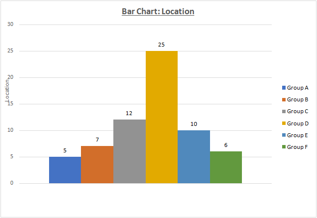
The graph above clearly indicates that individual distribution across locations is not similar. There are 25 individuals at Location D while only 5 individuals at Location A. This is evidence of the disparity across locations.
b) Pie chart is the suitable graphical technique here. This is primarily because objective does not involve highlighting the absolute valus but need to consider the percentage contribution toward each of the occupations. The suitable graph has been illustrated as follows.
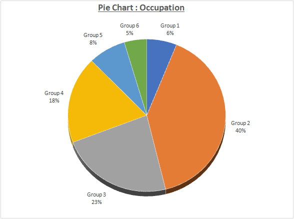
The pie chart above indicates the disparity in occupation across various groups. It is evident that Group 2 has the maximum contribution of 40% while Group 6 has the least contribution of 5%..
Answer 4
Sturges rule has been used by the researcher in order to outline the suitable number of classes to be used for the given data (Hastie, Tibshirani and Friedman, 2014).
a)
Classes required = 1+ 3.3 log n
where n = total observations count
In the given case, n = 65
Hence, the required number of classes = 1 + 3.3 log 65 = 1 + 3.3*1.81 = 6.98
The total classes has been decided as 7 following the above approach.
.b) After determining the classes required as 7, the range of the underlying variable is considered. In this regards, the lowest and highest values are considered. TO determine the class interval, the range is computed and the same is divided by 7(classes desired) so that the class width may be determined. Some tweaking may be required so as to ensure that class width assumes an integer as the value (Taylor and Cihon, 2017).
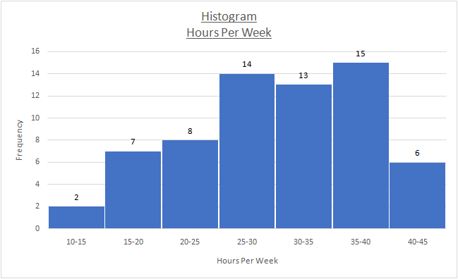
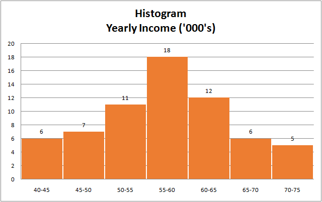
c) The histogram for the given variable has been obtained using Excel and illustrated as follows.
Owing to the presence of negative skew, the histogram has a asymmetric shape. It is apparent that the tail on left of mean exceeds the one on right.
The above histogram seems symmetric in shape as the mean of the data seems to be located in the middle and decline in frequency if one moves away from mean in either direction.
Answer 5
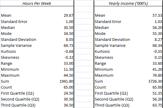
a) Numerical summary for the given variables has been obtained using Excel and summarised below.
b) The correlation analysis for the given variables has been run with the aid of Excel and results are expressed as follows.
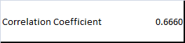
The correlation coefficient is positive which implies that a positive relationship exists between the given variables and hence the change in both variables is expected in the same direction. Further, the correlation coefficient matrix is higher than 0.6 which would mean that a strong relationship is present between the two variables (Hastie, Tibshirani and Friedman, 2014).
Answer 6
a) The independent variable is weekly hours worked while the dependent variable is the yearly income. The selection of the variables is such because the income is a function of the work hours.
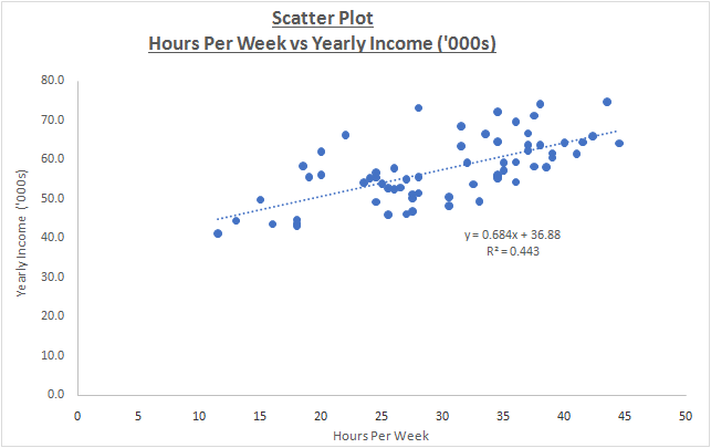
b) The scatter plot between the above variables has been drawn using Excel and illustrated as follows.
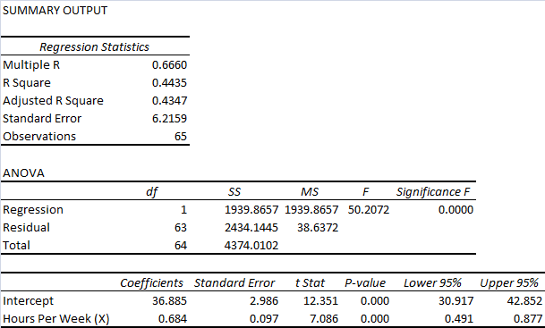
c) The output of regression analysis as derived from Excel is indicated as follows.
The equation of regression line based on the above output is represented as follows.
Yearly income ($ 000’s) = 36.885 + 0.684*(Hours per Week)
Value of intercept is 36.885. This would be the annual income expected in $ 000’s if there is zero working hours per week. The slope coefficient is 0.684 which indicates that any change in the weekly working hours by even 1 hour would alter the annual income by $ 684. Further, the positive slope coefficient would imply that the direction change for the variable would be same (Medhi, 2016).
d) R2 (also known as coefficient of determination) has been computed as 0.4435. this is indicative that 44.35% of yearly income changes are attributed to corresponding changes in weekly working hours. However, 55.65% of the changes in yearly income are not explained by the current regression model (Taylor and Cihon, 2017).
References
Hastie, T., Tibshirani, R. and Friedman, J. (2014) The Elements of Statistical Learning. 4th ed. New York: Springer Publications.
Medhi, J. (2016) Statistical Methods: An Introductory Text. 4th ed. statistics assignment Sydney: New Age International.
Taylor, K. J. and Cihon, C. (2017) Statistical Techniques for Data Analysis. 2nd ed. Melbourne: CRC Press.