
Statistics Assignment Evaluating Statistical Techniques To Solve Business Problems
Question
Task:
Purpose:
This statistics assignment aims at Understand various qualitative and quantitative research methodologies and techniques, and other general purposes are:
1. Explain how statistical techniques can solve business problems
2. Identify and evaluate valid statistical techniques in a given scenario to solve business problems
3. Explain and justify the results of a statistical analysis in the context of critical reasoning for a business problem solving
4. Apply statistical knowledge to summarize data graphically and statistically, either manually or via a computer package
5. Justify and interpret statistical/analytical scenarios that best fits business solution.
Please read below information carefully and respond all questions listed.
Question 1
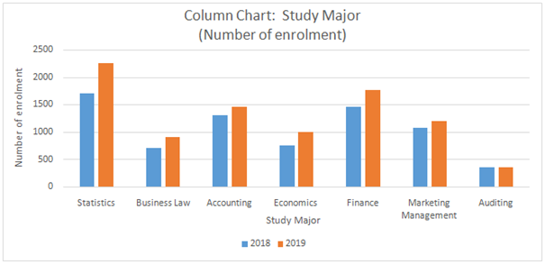
The higher education department of Holmes Institute recorded data on the number of students enrolled in the different study majors for the years 2018 and 2019.
a) Use an appropriate graphical technique or chart to compare the number of enrolments in 2018 and 2019 of the different study majors. Display the chart.
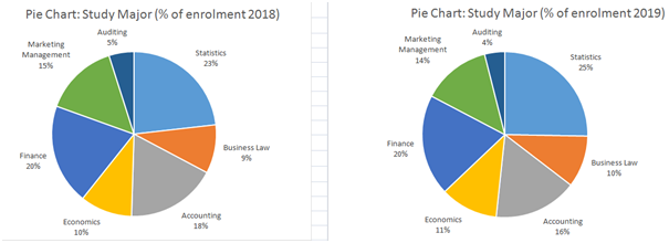
b) Use an appropriate graphical technique or chart to display the percentage value of the number of enrolments of the different study major in 2018 and 2019. Display the chart.
Question 2
Sociologists argued that women on average earn less than men as women often choose to work less hours. They further suggest that the choice of hours worked may be driven by various factors such as age, childcare needs, occupation choice and flexibility. To investigate the relation between hours worked and income earned by Australian men and women, a researcher plans to survey a sample of individuals across the country. Briefly explain (using no more than 250 words in total for this question)
a) What type of survey method the researcher could use and why
b) What sampling method could the researcher use to select his/her sample and why
c) What are the two main variables the researcher should consider collecting data for the purpose of the above analysis and why Identify the data type(s) for the variables.
d) What kind of issues the researcher may face in this data collection
Suppose a researcher has collected data from a sample of 65 individuals using the sampling method you have proposed in (b). For each individual, the hours worked per week and yearly income (measured in ‘000’s dollars) were recorded.
Question 3
First, the researcher categorised the data into six location groups and six occupation groups, and calculated the frequencies given below.
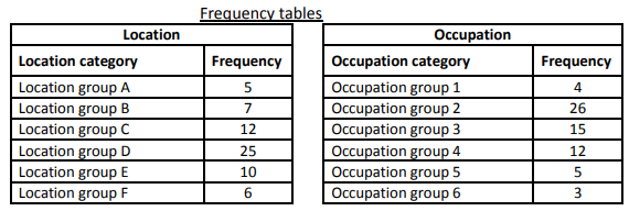
Using Excel and the data in the frequency tables above, answer the following questions.
a) Which graphical technique or chart should be used if the researcher is interested in comparing the number of individuals in each location group Explain the reason for the selection of this graphical chart. Construct and display the chart, also briefly describe what you can observe about the number of individuals belonging to each location category.
b) Which graphical technique or chart should be used if the researcher is interested in comparing the proportion of the number of individuals in each occupation group Explain the reason for the selection of this graphical chart. Construct and display the chart, also briefly describe what you can observe about the proportion of the number of individuals belonging to each occupation category.
Question 4
Second, the researcher wishes to use graphical descriptive methods to present summaries of the data on each of the two variables: hours worked per week and yearly income.
a) The number of observations (n) is 65 individuals. The researcher suggests using 7 class intervals to construct a histogram for each variable. Explain how the researcher would have decided on the number of class intervals (K) as 7.
b) The researcher suggests using class intervals as 10 < X 15, 15 < X 20, …, 40 < X 45 for the hours per week variable and class intervals 40 < X 45, 45 < X 50, ..., 70 < X 75 for the yearly income variable. Explain how the researcher would have decided the width of the above class intervals (or class width).
c) Draw and display a histogram for each of the two variables using appropriate BIN values from part (b) and comment on the shape of the two distributions.
Question 5
Third, the researcher wishes to use numerical descriptive measures to summarize the data on each of the two variables: hours worked per week and yearly income.
a) Prepare and display a numerical summary report for each of the two variables including summary measures such as mean, median, range, variance, standard deviation, smallest and largest values and the three quartiles. Notes: Use QUARTILE.EXC command to generate the three quartiles.
b) Compute the correlation coefficient using the relevant Excel function to measure the direction and strength of the linear relationship between the two variables. Display and interpret the correlation value.
Question 6
Finally, the researcher considers using regression analysis to establish a linear relationship between the two variables – hours worked per week and yearly income.
a) What is the dependent variable and independent variable for this analysis Why
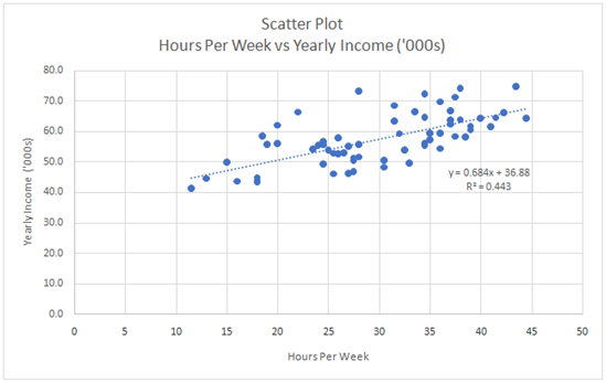
b) Use an appropriate plot to investigate the relationship between the two variables. Display the plot. On the same plot, fit a linear trend line including the equation and the coefficient of determination R2 .
c) Estimate a simple linear regression model and present the estimated linear equation. Display the regression summary table and interpret the intercept and slope coefficient estimates of the linear model.
d) Display and interpret the value of the coefficient of determination, R-squared.
Answer
Answer 1
a) The requisite chart is highlighted below within this statistics assignment.
b) The requisite graph is illustrated below.
Answer 2
a) An online survey method would be suitable for collection of data. This is because of two reasons. First is that the sample would require selection of individuals from various parts of Australia making a face to face survey practically impossible and very resource consuming. Also, the nature of information and survey questions seems close ended owing to which there would not be much doubt in the respondents mind at the time of responding to the survey (Hillier, 2016).
b) The appropriate sampling technique would be stratified random sampling. Stratified random sampling is preferred over simple random sampling as there are key factors such as age, occupation, childcare needs which tend to influence the hours worked. As a result, the first step of the sampling would be to segregate the population of interest based on the key attributes for the given study. Then, randomly from each attribute selections can be made in proportion of their representation in the population so that the sample finally obtained is representation of the underlying population (Hair et. al., 2015).
c) The two main variables for which data must be collected by the researcher correspond to hours worked and the income earned. Both of these variables would have numerical values and hence would be quantitative variables. Additionally, the appropriate measurement scale to be used for both these variables would be ratio scale since absolute zero can be defined for both variables as negative values are not permissible (Flick, 2015).
d) One issue that the researcher may face is that the sample may be biased owing to non-response from some intended respondents. Another issue is that the data provided may be erroneous due to incorrect responses from the respondents. Yet another issue is that the sample is not representative of the underlying population of interest especially with regards to key attributes identified for the given study (Eriksson and Kovalainen, 2015).
Answer 3
a) The requisite graphical technique is a bar chart. This graphical chart has been selected since the objective is to display the absolute value for certain categories of a given variable (location). The appropriate chart has been drawn using Excel and pasted below.
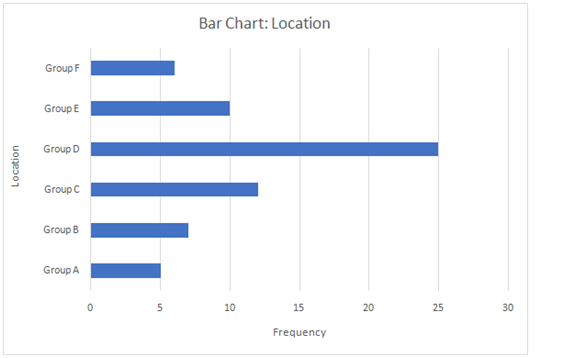
From the above graph, it can be inferred that distribution of individuals across different locations is quite dissimilar to one another. The maximum number of individuals are located at Location D with 25 individuals while the minimum number of individuals are located at Location A with only 5 individuals.
b) The appropriate graphical technique is a pie chart. This is suitable since the objective in this case is not to indicate the absolute values but rather the proportion of individuals belonging to various occupations which is best represented using a pie chart. The appropriate graph has been drawn using Excel and pasted below.
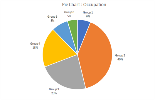
From the above pie chart, it is apparent that the share of various groups in occupation is quite different. The maximum proportion of individuals is observed for Group 2 (40%) while the minimum proportion of individuals is observed for Group 6 (5%).
Answer 4
a) The number of class intervals would have been determined by the researcher based on Sturges Rule. As per this rule, the number of classes is given below (Flick, 2015).
Number of classes = 1+ 3.3 log n where n is the total number of observations.
Here, n = 65
Number of classes = 1 + 3.3 log 65 = 1 + 3.3*1.81 = 6.98
This is how the researcher would have decided the class intervals as 7.
b) Once the researcher has determined the number of classes as 7, then the maximum and minimum value of the given variable would be considered. The difference between the above two values would be divided by the number of classes so as to determine the class width. Some modification may be done so as to ensure that class width takes an integral value. This is how the class width has been determined in the given scenario (Hair et. al.,2015).
c) The requisite histograms have been drawn using Excel and pasted below.
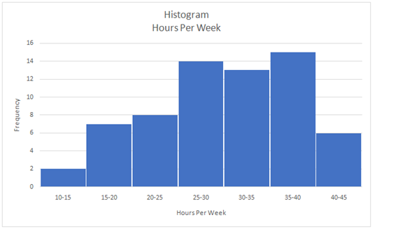
The shape of the above histogram is asymmetric as there is negative skew present. This is evident from the fact that left tail is longer than the right tail.
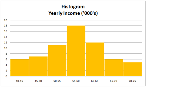
The shape of the above histogram is symmetric as the highest frequency class is in the middle with progressively decreasing frequency of classes on either side.
Answer 5
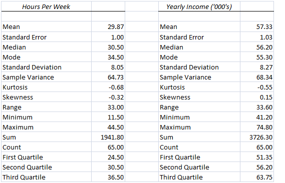
a) The requisite numerical summary for the two variables.
b) The requisite correlation analysis between the two variables has been performed using Excel and the relevant result pasted below.
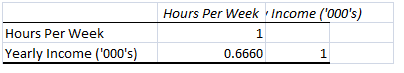
The positive value of correlation coefficient indicates that the two variables have a positive relationship and hence tend to move in the same direction. Also, the magnitude of the correlation coefficient exceeds 0.6 which implies that the strength of relationship between the variables is strong (Hillier, 2016).
Answer 6
a) The dependent variable is yearly income while the independent variable is hours worked per week. The above variables have been selected since the income would be dependent on the hours of work and not vice-versa,
b) The requisite scatter plot has been obtained in Excel and pasted below.
c) The requisite regression output obtained from Excel is pasted below.
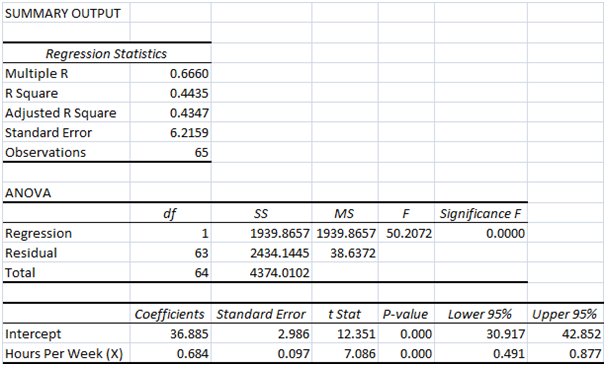
The regression equation is indicated below.
Yearly income (000’s) = 36.885 + 0.684*(Hours per Week)
The intercept is 36.885 which is the expected annual income (in $000’s) when the weekly working hours is zero. The slope is 0.684 which implies that a change in the working hours per week would lead to a change of $ 684 in the annual income. Also, the direction of change for both variables is same since slope is positive 9Eriksson and Kovalainen, 2015).
d) The coefficient of determination is 0.4435. This implies that 44.35 % of the changes in the dependent variable (i.e. yearly income) can be accounted for by corresponding changes in the independent variable (i.e. hours per week).
References
Eriksson, P. and Kovalainen, A. (2015) Quantitative methods in business research. 3rd ed. London: Sage Publications.
Flick, U. (2015) Introducing research methodology: A beginner's guide to doing a research project. 4th ed. New York: Sage Publications.
Hair, J. F., Wolfinbarger, M., Money, A. H., Samouel, P., and Page, M. J. (2015) Essentials of business research methods.statistics assignment 2nd ed. New York: Routledge.
Hillier, F. (2016) Introduction to Operations Research.6th ed.New York: McGraw Hill Publications.